ubkev Posted June 21, 2017 Report Share Posted June 21, 2017 (edited) Hat tip to the Sabres for not being able to put a working link to the photos of the jerseys on their own freaking mobile app.Did we expect anything less?#firstclass Edited June 21, 2017 by ubkev Quote Link to comment Share on other sites More sharing options...
carpandean Posted June 21, 2017 Report Share Posted June 21, 2017 (edited) Basically the same for me. I bought a Winter Classic jersey and I have two of those Royal blue CCM hats. That's it. Did you buy a game-worn WC jersey? They never sold the actual WC jerseys: What they sold as the WC jersey was just a throwback white. No laces on the collar. Not as dark blue. Those should be our home jerseys now. Edited June 21, 2017 by carpandean Quote Link to comment Share on other sites More sharing options...
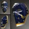
darksabre Posted June 21, 2017 Report Share Posted June 21, 2017 Did you buy a game-worn WC jersey? They never sold the actual WC jerseys: What they sold as the WC jersey was just a throwback white. No laces on the collar. Not as dark blue. Those should be our home jerseys now. Just one of the throwback whites. Got it with Numminen on it even though he was out for heart surgery. Quote Link to comment Share on other sites More sharing options...
SabresBillsFan Posted June 21, 2017 Report Share Posted June 21, 2017 Did you buy a game-worn WC jersey? They never sold the actual WC jerseys: What they sold as the WC jersey was just a throwback white. No laces on the collar. Not as dark blue. Those should be our home jerseys now. Love that jersey Quote Link to comment Share on other sites More sharing options...
dudacek Posted June 21, 2017 Report Share Posted June 21, 2017 Love that jersey The best-ever Sabres white Quote Link to comment Share on other sites More sharing options...
CallawaySabres Posted June 21, 2017 Author Report Share Posted June 21, 2017 Why no shoulder patches.....how deaf are these people? Quote Link to comment Share on other sites More sharing options...
LGR4GM Posted June 21, 2017 Report Share Posted June 21, 2017 I don't like our white jerseys Quote Link to comment Share on other sites More sharing options...
Robviously Posted June 21, 2017 Report Share Posted June 21, 2017 (edited) Did you buy a game-worn WC jersey? They never sold the actual WC jerseys: What they sold as the WC jersey was just a throwback white. No laces on the collar. Not as dark blue. Those should be our home jerseys now. That jersey is a work of art. And for anyone who wonders why I'm always freaking out about this stuff (other than it ties to my job), look how clean and strong our logo looks without all the unnecessary outlining. It's beautiful even in the navy blue. Edited June 21, 2017 by Robviously Quote Link to comment Share on other sites More sharing options...
LGR4GM Posted June 21, 2017 Report Share Posted June 21, 2017 That jersey is a work of art. And for anyone who wonders why I'm always freaking out about this stuff (other than it ties to my job), look how clean and strong our logo looks without all the unnecessary outlining. It's beautiful even in the navy blue.Agreed. We should write a petition to Pegulas Inc Quote Link to comment Share on other sites More sharing options...
darksabre Posted June 21, 2017 Report Share Posted June 21, 2017 Agreed. We should write a petition to Pegulas Inc I'm pretty sure they know what the fans want. It's like 80% of all responses to anything they do. They're just actively ignoring us. Quote Link to comment Share on other sites More sharing options...
Eleven Posted June 21, 2017 Report Share Posted June 21, 2017 I'm pretty sure they know what the fans want. It's like 80% of all responses to anything they do. They're just actively ignoring us. It's not even just them. The whole league knows we all want whites at home. Quote Link to comment Share on other sites More sharing options...
LGR4GM Posted June 21, 2017 Report Share Posted June 21, 2017 It's not even just them. The whole league knows we all want whites at home.I don't want these whites at home. WC whites sure. Quote Link to comment Share on other sites More sharing options...
nucci Posted June 21, 2017 Report Share Posted June 21, 2017 I don't like our white jerseys They look very plain Quote Link to comment Share on other sites More sharing options...
Marvelo Posted June 21, 2017 Report Share Posted June 21, 2017 So long to the pit stain, a point of embarrassment for many seasons. I wonder who's the jag that came up with that idea? Quote Link to comment Share on other sites More sharing options...
Sabre Dance Posted June 21, 2017 Report Share Posted June 21, 2017 Just on quick perusal of all of the new jerseys, a few comments: 1) The designs for all of the teams seem to have been "simplified", i.e., made a little more "traditional". Not a bad idea in general, but for some reason all of the jerseys look a little too...boring? Meh. 2) I read the description on Adidas' web site of how many improvements have been made: lighter weight, stronger, etc. Somewhere in that process, they made all of the jerseys less expensive-looking - like they were replicas instead of authentic. Again, meh. 3) I don't like the addition of the white/gold split stripes on the dark Sabres jerseys, nor the split blue/silver (white?) stripes on the away sweaters. Meh cubed. 4) I am glad to see the curved hem at the bottom of the jerseys is gone. That's about it. Nothing else to see here....move along, move along. Quote Link to comment Share on other sites More sharing options...
CallawaySabres Posted June 21, 2017 Author Report Share Posted June 21, 2017 So long to the pit stain, a point of embarrassment for many seasons. I wonder who's the jag that came up with that idea? I could tell you the person who has done this since the slug but he is a friend. Trust me, I even sent him the rendition I loved a few pages back......nothing, won't budge. Quote Link to comment Share on other sites More sharing options...
That Aud Smell Posted June 21, 2017 Report Share Posted June 21, 2017 Just on quick perusal of all of the new jerseys, a few comments: 1) The designs for all of the teams seem to have been "simplified", i.e., made a little more "traditional". Not a bad idea in general, but for some reason all of the jerseys look a little too...boring? Meh. I'd read from a couple of people on the Twitter that all that "space" we now see on the new jerseys is being reserved for the future placement of advertisement patches. Quote Link to comment Share on other sites More sharing options...
TrueBlueGED Posted June 21, 2017 Report Share Posted June 21, 2017 I'd read from a couple of people on the Twitter that all that "space" we now see on the new jerseys is being reserved for the future placement of advertisement patches. Yup. Gotta find some way to increase revenue. Well, other than making the game appeal to a broader audience, can't have that happen! :wallbash: Quote Link to comment Share on other sites More sharing options...
WildCard Posted June 21, 2017 Report Share Posted June 21, 2017 I'd read from a couple of people on the Twitter that all that "space" we now see on the new jerseys is being reserved for the future placement of advertisement patches. Not surprised at all. Soon as we switched to Adidas I had a feeling that it was going to happen. The NBA is experimenting with it this year, and by experimenting I mean easing in inevitability onto the fans Quote Link to comment Share on other sites More sharing options...
Robviously Posted June 21, 2017 Report Share Posted June 21, 2017 (edited) DCzzbIpUAAQDv0X.jpg I really didn't like their logo when it came out. The "V" in the negative space is great but the helmet seems too long and has no interesting details to it. It doesn't look like a hockey crest; it looks like something that was designed to be shrunk down and put on hats and t-shirts (which it probably is). That said, I like the jerseys more than I thought I would. Really like that the primary color is steel gray and not black, and there's some really interesting detailing in the crest in the black area around the helmet and also in the gold parts of the sleeves. (Check out some of the zoomed in, higher-res shots online.) The colors look pretty good if you see pictures where everything isn't under the weird spotlights from the events last night. I'm cautiously optimistic that these will look pretty cool in person and hopefully on TV as well. EDIT: Some good pics here of what I'm talking about: http://www.cbssports.com/nhl/news/look-vegas-golden-knights-unveil-jerseys-for-franchises-inaugural-nhl-season/ Edited June 21, 2017 by Robviously Quote Link to comment Share on other sites More sharing options...
Taro T Posted June 21, 2017 Report Share Posted June 21, 2017 Just noticed looking back @ all 31 sweaters, the Sabres are the only team w/ #'s on the front. Surprised they're the only ones to keep that. Quote Link to comment Share on other sites More sharing options...
LGR4GM Posted June 21, 2017 Report Share Posted June 21, 2017 I like the front number. Quote Link to comment Share on other sites More sharing options...
sabills Posted June 21, 2017 Report Share Posted June 21, 2017 Just noticed looking back @ all 31 sweaters, the Sabres are the only team w/ #'s on the front. Surprised they're the only ones to keep that. They were the first, and they are the last. I like the front number. Agreed. And I think I like it more now that we're the only ones with it. Its unique, and I dig that. Quote Link to comment Share on other sites More sharing options...
Eleven Posted June 21, 2017 Report Share Posted June 21, 2017 They were the first, and they are the last. Agreed. And I think I like it more now that we're the only ones with it. Its unique, and I dig that. Were they the first? Not Dallas? Quote Link to comment Share on other sites More sharing options...
sabills Posted June 21, 2017 Report Share Posted June 21, 2017 Were they the first? Not Dallas? I thought it was a Larry Quinn thing? Quote Link to comment Share on other sites More sharing options...
Recommended Posts
Join the conversation
You can post now and register later. If you have an account, sign in now to post with your account.