Randall Flagg Posted June 21, 2017 Report Share Posted June 21, 2017 Now that the front isn't as busy, I like the numbers there too. Quote Link to comment Share on other sites More sharing options...
Eleven Posted June 21, 2017 Report Share Posted June 21, 2017 I thought it was a Larry Quinn thing? So I just did some digging. Buffalo first had the numbers on front in 2006. Dallas in 2008. Quote Link to comment Share on other sites More sharing options...
sabills Posted June 21, 2017 Report Share Posted June 21, 2017 So I just did some digging. Buffalo first had the numbers on front in 2006. Dallas in 2008. My font of useless knowledge comes through once again. Quote Link to comment Share on other sites More sharing options...
atoq Posted June 21, 2017 Report Share Posted June 21, 2017 I'm not a fan of the numbers on the front. Those were the product of the same Larry Quinn focus group sessions that gave us the slug, and they still remind me of that era. It seems like it was an attempt to promote fans/TV viewers associating players with their number by sticking the number right next to their face. However, the number on the front of the jersey became completely unnecessary once they added numbers on the helmets in ~2011. They seem redundant now and clutter up an otherwise clean design. I'm surprised to see the support for the numbers here, given the prevalent desire to go back to a more traditional jersey design. Would you all be alright with them going to old jersey designs and throwing the front numbers on there? I'm disappointed they decided to maintain the status quo with the jerseys (especially the striping on the whites), besides the obvious move to get rid of the pit stains and piping. I agree that they are likely waiting for the 50 year anniversary to do a more thorough overhaul of the jerseys. I wonder if part of the decision is waiting for the team to be better, so that they can launch new jerseys when people are more excited about the team, and so that people associate new jerseys with a better product. It would be interesting to hear the decision making process that goes into the timing of team aesthetics, with considerations for branding, etc. I'll jump on the bandwagon that the WC whites are some of the best. Quote Link to comment Share on other sites More sharing options...
carpandean Posted June 21, 2017 Report Share Posted June 21, 2017 (edited) EDIT: Some good pics here of what I'm talking about: http://www.cbssports.com/nhl/news/look-vegas-golden-knights-unveil-jerseys-for-franchises-inaugural-nhl-season/ Just noticed that the Wild jersey got the Pathers' "wanna be Montreal" treatment: The Habs must be pissed. They've had that design exclusively since the Blackhawks dropped it in the late 1930's (except for their WC/3rd homage to the same.) Edit: don't get me wrong; it's a sharp looking jersey. Edited June 21, 2017 by carpandean Quote Link to comment Share on other sites More sharing options...
Thorny Posted June 21, 2017 Report Share Posted June 21, 2017 I'm not a fan of the numbers on the front. Those were the product of the same Larry Quinn focus group sessions that gave us the slug, and they still remind me of that era. It seems like it was an attempt to promote fans/TV viewers associating players with their number by sticking the number right next to their face. However, the number on the front of the jersey became completely unnecessary once they added numbers on the helmets in ~2011. They seem redundant now and clutter up an otherwise clean design. I'm surprised to see the support for the numbers here, given the prevalent desire to go back to a more traditional jersey design. Would you all be alright with them going to old jersey designs and throwing the front numbers on there? I'm disappointed they decided to maintain the status quo with the jerseys (especially the striping on the whites), besides the obvious move to get rid of the pit stains and piping. I agree that they are likely waiting for the 50 year anniversary to do a more thorough overhaul of the jerseys. I wonder if part of the decision is waiting for the team to be better, so that they can launch new jerseys when people are more excited about the team, and so that people associate new jerseys with a better product. It would be interesting to hear the decision making process that goes into the timing of team aesthetics, with considerations for branding, etc. I'll jump on the bandwagon that the WC whites are some of the best. Smart. Let's hope the people in charge of this are, too. Quote Link to comment Share on other sites More sharing options...
darksabre Posted June 21, 2017 Report Share Posted June 21, 2017 Just noticed that the Wild jersey got the Pathers' "wanna be Montreal" treatment: The Habs must be pissed. They've had that design exclusively since the Blackhawks dropped it in the late 1930's (except for their WC/3rd homage to the same.) Edit: don't get me wrong; it's a sharp looking jersey. I really like what they did with Minnesota's jerseys. I think they've got one of the best transitions from their current set. Then when they go back to multiple stripes and whatnot somewhere down the line it'll look good again. Quote Link to comment Share on other sites More sharing options...
Doohickie Posted June 21, 2017 Report Share Posted June 21, 2017 Just noticed that the Wild jersey got the Pathers' "wanna be Montreal" treatment: The Habs must be pissed. They've had that design exclusively since the Blackhawks dropped it in the late 1930's (except for their WC/3rd homage to the same.) Edit: don't get me wrong; it's a sharp looking jersey. Imitation is the sincerest form of flattery. And it's not like Minnie is the first to copy the Habs. Quote Link to comment Share on other sites More sharing options...
LTS Posted June 21, 2017 Report Share Posted June 21, 2017 Knew this thread would explode after last night. The personal preference things always do. Some nice changes... we'll see where things go from here. Also, the #'s only appeared on the blue sweaters? The white one's did not have #'s on the front. Quote Link to comment Share on other sites More sharing options...
sabills Posted June 21, 2017 Report Share Posted June 21, 2017 Knew this thread would explode after last night. The personal preference things always do. Some nice changes... we'll see where things go from here. Also, the #'s only appeared on the blue sweaters? The white one's did not have #'s on the front. They also don't have any on the shoulders, so I'd bet they'll still show up at some point. Quote Link to comment Share on other sites More sharing options...
spndnchz Posted June 21, 2017 Report Share Posted June 21, 2017 They also don't have any on the shoulders, so I'd bet they'll still show up at some point. They've moved the shoulders patches lower. They're now butt patches on the pants. Something about 'wind resistance'. Quote Link to comment Share on other sites More sharing options...
Sabre Dance Posted June 21, 2017 Report Share Posted June 21, 2017 Imitation is the sincerest form of flattery. And it's not like Minnie is the first to copy the Habs. Is it just me or does this look like a rugby jersey? Wait, I get it....Rugby on Ice, a new show at Mandalay Bay. :D Quote Link to comment Share on other sites More sharing options...
carpandean Posted June 21, 2017 Report Share Posted June 21, 2017 Imitation is the sincerest form of flattery. And it's not like Minnie is the first to copy the Habs. Yes, I know ... Just noticed that the Wild jersey got the Pathers' "wanna be Montreal" treatment: :P Quote Link to comment Share on other sites More sharing options...
sabills Posted June 21, 2017 Report Share Posted June 21, 2017 They've moved the shoulders patches lower. They're now butt patches on the pants. Something about 'wind resistance'. They'll have to move them again when they get sponsored by "JUICY" Quote Link to comment Share on other sites More sharing options...
darksabre Posted June 21, 2017 Report Share Posted June 21, 2017 They'll have to move them again when they get sponsored by "JUICY" PRINCESS Cruise Lines... Quote Link to comment Share on other sites More sharing options...
sodbuster Posted June 21, 2017 Report Share Posted June 21, 2017 They've moved the shoulders patches lower. They're now butt patches on the pants. Something about 'wind resistance'.Oh, they would catch plenty of wind if they were in the back of my pants. Quote Link to comment Share on other sites More sharing options...
Doohickie Posted June 21, 2017 Report Share Posted June 21, 2017 Is it just me or does this look like a rugby jersey? Wait, I get it....Rugby on Ice, a new show at Mandalay Bay. :D It does, and it's a nice look. The new Panthers jerseys are among my favorite non-Sabres jerseys (along with the Columbus 3rds and the original Coyotes). Quote Link to comment Share on other sites More sharing options...
Marvelo Posted June 22, 2017 Report Share Posted June 22, 2017 I could tell you the person who has done this since the slug but he is a friend. Trust me, I even sent him the rendition I loved a few pages back......nothing, won't budge. Friend or not, he should have been tar and feathered for designing that horrible pit stain. Quote Link to comment Share on other sites More sharing options...
Thorny Posted June 22, 2017 Report Share Posted June 22, 2017 Are the pit stains definitely gone on the new jerseys? Quote Link to comment Share on other sites More sharing options...
Doohickie Posted June 22, 2017 Report Share Posted June 22, 2017 Are the pit stains definitely gone on the new jerseys? Yes. Except ROR's jersey. The dude sweats, what can I say? Quote Link to comment Share on other sites More sharing options...
Thorny Posted June 22, 2017 Report Share Posted June 22, 2017 Yes. Except ROR's jersey. The dude sweats, what can I say? :lol: Quote Link to comment Share on other sites More sharing options...
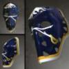
ubkev Posted June 22, 2017 Report Share Posted June 22, 2017 (edited) First reaction: meh, I don't think I hate this hat. But I don't think I like it either. It helps if you paste the tweet, idiot. https://twitter.com/SabresStore/status/877891310132363264 Edited June 22, 2017 by ubkev Quote Link to comment Share on other sites More sharing options...
darksabre Posted June 22, 2017 Report Share Posted June 22, 2017 First reaction: meh, I don't think I hate this hat. But I don't think I like it either. It helps if you paste the tweet, idiot. https://twitter.com/SabresStore/status/877891310132363264 Booorrrrrinnggggg Quote Link to comment Share on other sites More sharing options...
MattPie Posted June 22, 2017 Report Share Posted June 22, 2017 Booorrrrrinnggggg Classsssssic! :) Quote Link to comment Share on other sites More sharing options...
sodbuster Posted June 22, 2017 Report Share Posted June 22, 2017 I kinda like that hat. Not as much as my current Sabres cap, so I'm not buying one, but I like it. Quote Link to comment Share on other sites More sharing options...
Recommended Posts
Join the conversation
You can post now and register later. If you have an account, sign in now to post with your account.