Sabres Fan in NS Posted February 17, 2022 Report Share Posted February 17, 2022 I don't really like it. Would have preferred the Goat Head. 2 Quote Link to comment Share on other sites More sharing options...
PromoTheRobot Posted February 17, 2022 Report Share Posted February 17, 2022 2 hours ago, PASabreFan said: Uh no. It's uninspired and in no way shouts HERITAGE. Your Pepsi cap would do just that. Other than being the Sabres ORIGINAL logo. Quote Link to comment Share on other sites More sharing options...
Spoonman Posted February 17, 2022 Report Share Posted February 17, 2022 15 hours ago, The Ghost of Yuri said: I like it but I'm not wowed by it. I love the Buffalo on chest! Quote Link to comment Share on other sites More sharing options...
PASabreFan Posted February 17, 2022 Report Share Posted February 17, 2022 3 hours ago, PromoTheRobot said: Other than being the Sabres ORIGINAL logo. Not really. This would have been fun and self aware. Quote Link to comment Share on other sites More sharing options...
dudacek Posted February 17, 2022 Report Share Posted February 17, 2022 (edited) 13 minutes ago, PASabreFan said: Not really. This would have been fun and self aware. Alex Tuch would look so good in Winwell with that stache Edited February 17, 2022 by dudacek Quote Link to comment Share on other sites More sharing options...
Weave Posted February 17, 2022 Report Share Posted February 17, 2022 25 minutes ago, PASabreFan said: Not really. This would have been fun and self aware. And is the definition of heritage, innit? Quote Link to comment Share on other sites More sharing options...
PASabreFan Posted February 17, 2022 Report Share Posted February 17, 2022 52 minutes ago, Weave said: And is the definition of heritage, innit? I'm talking about the weirdo logo. That's our heritage. Danny Gare was briefly dating a second grade teacher from Niagara Falls and her kids cut out the logos in art class. Quote Link to comment Share on other sites More sharing options...
PromoTheRobot Posted February 17, 2022 Report Share Posted February 17, 2022 1 hour ago, PASabreFan said: Not really. This would have been fun and self aware. 1 hour ago, Weave said: And is the definition of heritage, innit? You are going to have to bear with me here. That logo and the logo in the Heritage jerseys are identical. So what are you referring to exactly? Blue jersey? Moustaches? Perreault? Quote Link to comment Share on other sites More sharing options...
Thorny Posted February 17, 2022 Report Share Posted February 17, 2022 It’s about half the size of the current Quote Link to comment Share on other sites More sharing options...
PromoTheRobot Posted February 17, 2022 Report Share Posted February 17, 2022 1 minute ago, Thorny said: It’s about half the size of the current Quote Link to comment Share on other sites More sharing options...
Taro T Posted February 17, 2022 Report Share Posted February 17, 2022 4 minutes ago, PromoTheRobot said: You are going to have to bear with me here. That logo and the logo in the Heritage jerseys are identical. So what are you referring to exactly? Blue jersey? Moustaches? Perreault? No. The logo on the front of the sweaters is IDENTICAL to the logo they are CURRENTLY wearing on their regular unis. The hump on the back of the buffalo is almost exactly (if not exactly) the same as the one on the original trademarked logo. It is nothing at all similar to what seamstresses in the late '70's & early '80's bastardized the Buffalo into. 1 Quote Link to comment Share on other sites More sharing options...
pi2000 Posted February 18, 2022 Report Share Posted February 18, 2022 I like the jerseys. The cream is nice. Quote Link to comment Share on other sites More sharing options...
Brawndo Posted February 18, 2022 Author Report Share Posted February 18, 2022 Here are Toronto’s Quote Link to comment Share on other sites More sharing options...
LGR4GM Posted February 18, 2022 Report Share Posted February 18, 2022 Just now, Brawndo said: Here are Toronto’s Quote Link to comment Share on other sites More sharing options...
Taro T Posted February 18, 2022 Report Share Posted February 18, 2022 12 minutes ago, Brawndo said: Here are Toronto’s Wtf are "Aretnas?" Quote Link to comment Share on other sites More sharing options...
LGR4GM Posted February 18, 2022 Report Share Posted February 18, 2022 5 minutes ago, Taro T said: Wtf are "Aretnas?" Like regular retinas but A rated. Quote Link to comment Share on other sites More sharing options...
Marvin Posted February 18, 2022 Report Share Posted February 18, 2022 1 hour ago, Taro T said: Wtf are "Aretnas?" The Toronto Arenas were the original name of the Toronto Maple Leafs when the NHL was founded. Quote Link to comment Share on other sites More sharing options...
Taro T Posted February 18, 2022 Report Share Posted February 18, 2022 Just now, Marvin, Sabres Fan said: The Toronto Arenas were the original name of the Toronto Maple Leafs when the NHL was founded. The shirts don't say "Arenas;" they say "Aretnas." Once again, wtf is an Aretna. PS They also were the St. Pats for a while. 1 Quote Link to comment Share on other sites More sharing options...
PASabreFan Posted February 18, 2022 Report Share Posted February 18, 2022 At least Toronto tried. Quote Link to comment Share on other sites More sharing options...
LGR4GM Posted February 18, 2022 Report Share Posted February 18, 2022 2 hours ago, PASabreFan said: At least Toronto tried. Strange that you'll give Toronto a pass for trying but if Buffalo tries and fails you're all aboard the doom and gloom train. Quote Link to comment Share on other sites More sharing options...
7+6=13 Posted February 18, 2022 Report Share Posted February 18, 2022 When Biron was holding it up during the 1st intermission and you could see it up close and the detail - I thought it was very nicely done. Quote Link to comment Share on other sites More sharing options...
IKnowPhysics Posted February 18, 2022 Report Share Posted February 18, 2022 Welp, at least theirs suck more. I don't mind most of the specific details on ours, and I still love Hairy Buffalo, but the cream color jersey heralds an era of cotton jerseys that simply never existed during our frachise's history. It poses. I'd rather have seen strict Adidas adaptations of both teams' OG 1970 jerseys, proper crests and all, maybe slap a QEW highway sign patch on the upper chest, and call it good. They'd look better, sell better, and history better. 2 Quote Link to comment Share on other sites More sharing options...
carpandean Posted February 18, 2022 Report Share Posted February 18, 2022 (edited) 11 hours ago, Taro T said: The shirts don't say "Arenas;" they say "Aretnas." Once again, wtf is an Aretna. PS They also were the St. Pats for a while. Interestingly, they actually tried to split the difference between the two original Arenas jerseys. The first one just had a big white 'T' with no 'ARENAS' at all. The second was a true 'ARETNAS' jersey will all letters in white. Here, the name is contrasted to the point where, from far away, it looks like the original. Up close, however, you see the 'ARENAS' name like the second one. Kinda neat, from that standpoint. Edited February 18, 2022 by carpandean 2 Quote Link to comment Share on other sites More sharing options...
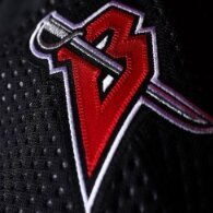
pastajoe Posted February 18, 2022 Report Share Posted February 18, 2022 Toronto’s looks like a practice jersey. If I’m going to pay for another Sabres jersey I’m not getting a dirty shade of their same jersey. Use the yellow shoulder buffalo as the main logo, or the goat head, or the B with the sword through it, or the written Buffalo they had on the 40th anniversary blue jersey, or a new logo like a herd of charging buffalo. Give me something new. Quote Link to comment Share on other sites More sharing options...
Sabres Fan in NS Posted February 18, 2022 Report Share Posted February 18, 2022 If the NHL wanted to have a true Heritage Classic they should have teams play against each other from the same eras. Sabres would play Vancouver, or maybe the Islanders and Washington could be in that group. All around 50 years old. Original six teams should play against other original six teams. All around 100 years old. '67 expansion teams should play against other '67 expansion teams or maybe lump them in with the 50 year history crowd. Everyone else plays against each other or better yet are not included. 2 Quote Link to comment Share on other sites More sharing options...
Recommended Posts
Join the conversation
You can post now and register later. If you have an account, sign in now to post with your account.