PASabreFan Posted May 2, 2006 Report Share Posted May 2, 2006 However, I know you and youre a purist. As far as you and I are concerned, the Buffalo Sabres are blue and gold. GO SABRES! I guess I'm a "purist." But the time to be a purist was back in 96. Changing uniforms was a mistake. Barring a switch back to the blue and gold, original logo, I think the purist position now is... don't make the same mistake again. The Buffalo Sabres are, for better or for worse, and for a generation of Sabre fans, black and red and demonic. Again, I have no problem with going back to the original logo, and blue and gold, even if the colors are tweaked a bit. But it doesn't sound like that's the direction they're going. Honestly, every once in a while, it seems like the Sabres manage to leak a story about the uniform change. It seems like they are just trying to keep the fire stoked. Link to comment Share on other sites More sharing options...
haseoke Posted May 2, 2006 Report Share Posted May 2, 2006 yeah, ive grown up on black and red sabres. thats my team. either leave that team the same or go straight back to the old colors. i could see (maybe) touching up the swords and the buffalo on the jersey, but look. blue and gold are the sabres colors because theyre colors with integrity. they have character. they look honest. even those sample jerseys just looks like they were polluting those colors up, making them seem hipper at the expense of their character. please, its a hockey team, not a music video, dont pick colors cause theyre snazzy, pick colors because they show the integrity of the game. a bright blue and gold, maybe add some silver, thats our team. j Link to comment Share on other sites More sharing options...
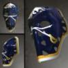
Orange Seats Posted May 2, 2006 Report Share Posted May 2, 2006 I'm hoping that this charging buffalo talk means that they made the original buffalo over crossed swords more "swift" looking. I really want to see the original logo back as chest crest and the angry goathead as shoulder patches. But this would leave out something I have also come to like... the B wit the sword. I think we all agree, at least, that red, black, and grey has to go. The only reason we have those colors is because they were the Adelphia corporate colors - crossmarketing at its crappiest. Bring back the blue and gold, even if its the goathead. And while we're talking colors, can we please have color stratified seating back again? Link to comment Share on other sites More sharing options...
Taro T Posted May 2, 2006 Report Share Posted May 2, 2006 I'm hoping that this charging buffalo talk means that they made the original buffalo over crossed swords more "swift" looking. I really want to see the original logo back as chest crest and the angry goathead as shoulder patches. But this would leave out something I have also come to like... the B wit the sword. I think we all agree, at least, that red, black, and grey has to go. The only reason we have those colors is because they were the Adelphia corporate colors - crossmarketing at its crappiest. Bring back the blue and gold, even if its the goathead. And while we're talking colors, can we please have color stratified seating back again? Not true, the only reason the Sabres have those colors is because Dougie Moss' girlfriend (Jennifer Smith) liked them. The day he got canned, she got the axe as well. (I think that she technically "resigned".) Allegedy, the staff was heard singing "ding, , the witch is dead" on that fateful day. (I've never confirmed that rumor, but believe it to be true.) As for shoulder patches, what's wrong with one Shatanic goathead (in the correct colors, b&g) and 1 B with a sword through it? Link to comment Share on other sites More sharing options...
Eleven Posted May 2, 2006 Report Share Posted May 2, 2006 As for shoulder patches, what's wrong with one Shatanic goathead (in the correct colors, b&g) and 1 B with a sword through it? Elmer's Glue still is not an official sponsor of the Sabres. Link to comment Share on other sites More sharing options...
PASabreFan Posted May 2, 2006 Report Share Posted May 2, 2006 Yeah, although Rigas had invested in the team by 1995-96, I don't think he technically took over ownership until much later. Dave will probably know the exact date -- damn you! :) I could be wrong, but I don't think Adelphia played a part in that decision. I love the comment about seat colors. I can understand why the new arena couldn't be like the Aud with its steep aisles -- building codes and such. But I never understood why the color scheme couldn't have been the same. Why there couldn't have been a little time and temperature clock. Standing room only. Players entering and leaving the ice at one end. Etc. Someone should do a prototype with ALL of the elements. That would be funny. Throw in the Bison uni while we're at it. I can hear Mike Robitaille in my head -- it looks like a hound's breakfast. Roby's the man! Link to comment Share on other sites More sharing options...
topshelfcookies Posted May 2, 2006 Report Share Posted May 2, 2006 I guess I'm a "purist." But the time to be a purist was back in 96. Changing uniforms was a mistake. Barring a switch back to the blue and gold, original logo, I think the purist position now is... don't make the same mistake again. The Buffalo Sabres are, for better or for worse, and for a generation of Sabre fans, black and red and demonic. Again, I have no problem with going back to the original logo, and blue and gold, even if the colors are tweaked a bit. But it doesn't sound like that's the direction they're going. Honestly, every once in a while, it seems like the Sabres manage to leak a story about the uniform change. It seems like they are just trying to keep the fire stoked. PA, I understand your point, but I think at the time, changing the uniforms was absolutely warrented. The Sabres were on the brink of developing a team that could contend, and had a couple of nationally recognized superstars on the team in LaFontaine and Hasek. At least the team changed colors/logos to mark the beginning of play in the new arena. So many times, teams change colors/logos for no reason whatsoever...at least back in '96 Buffalo had a reason to do so. I also sympathize with Dave B about the goathead logo---I actually really like it as a shoulder patch...just not as the primary logo. The Pierced B I can do without...to me it just looks so childish and cheesy. It's too similar to what the Bisons have done with their logos. If you want to talk about a REAL travesty...there's one. Why would the Herd go from a beautiful color design scheme and great logo (the script B with Buster swinging a bat), to a weird, clunky childish scheme? I shudder everytime I go down to Dunn Tire Park. The new Bisons unis look like something a town rec team would wear, not one of the best AAA teams in the country. Sigh. At this point though...I think maybe only Carolina can match Buffalo for the worst collection of non descript and generally bad uniforms for pro sports teams (NHL, NFL, MLB, MiLB, etc.) Link to comment Share on other sites More sharing options...
Orange Seats Posted May 2, 2006 Report Share Posted May 2, 2006 Oh I am with you all the way on the (baseball) Bison's uni's. Those blue and reds were gorgeous, as was the script B. I was but an elementary schooler when Pilot Field opened and remember going to a game with my dad and falling in love with the Blue/Red combo. Why they ever changed is beyond me (but the first time I saw the changed uni's it worried me because it reminded me of when the Blizzard added Super Duper logos to their shirts, you knew that was end of the line for that club). Going to my first major league game was such a dissapointment to me because it didn't come close to being at a Bison's game in the 1988 season, and for that I'll never forget the red and blue. Those were also the days when I'd go with dad to the annual Sabres v. USSR exhibition games. As much as Buffalo sports nostalgia is worth, I loved the inclusion of the Aud Club this year at the HSBC. I really doubt they'll be replacing the seats anytime soon, but if they ever do, they should think about putting the old color scheme in. They'll score some huge marketing points with anyone who ever attended an Aud Game. Telling your buddy that you got 100 level tickets is nowhere near as good as bragging about scoring a pair of "golds." Link to comment Share on other sites More sharing options...
topshelfcookies Posted May 2, 2006 Report Share Posted May 2, 2006 Orange Seats, by the way, welcome to the board... Your name, and post got me thinking. The LA Dodgers just replaced all of the seats in Dodger Stadium in the "throwback" colors from when it opened back in the 1960's. It looks pretty sweet...they switched the seat colors from bright yellow, orange, blue and red to the more muted colors from when the ballpark opened. The seats are now sort of a pastel yellow, light orange, turquoise and sky blue. Of course, the Dodgers didn't just repaint the seats...they replaced all of the seats in the ballpark...something that hadn't been done since the 70's. Still, bringing back the Golds, Reds, Blues and Oranges would be pretty tight for the Sabres. Maybe we could allow smoking and create a standing room only section somewhere too... OH! And bring back the rotating goal lights too! Watching highlights from the May Day game someone linked to on YouTube, I realized how much better those goal lights were at the Aud. Now we just have a lame red light that glows. Bring back the big thick rotating fire truck lights like you see on NHL 94 for Sega and maybe some flashing Alka-Seltzer or Trico ads on the boards. NOW we're talking Buffalo hockey! Link to comment Share on other sites More sharing options...
Bmwolf21 Posted May 2, 2006 Report Share Posted May 2, 2006 Some good suggestions here - I really like bringing back the color-coded seats and the rotating fire truck goal lights. As for the unis, I was never completely sold on the black/red/white combo - they did an OK job, but the logo is awful, and the whole thing (especially in hindsight) seemed like a big money grab by the new regime. I was all for tweaking the uniforms & color scheme, but I was hoping the team would stay pretty close to what they had always been. That being said, I probably would have bought into the new colors more if they had done a better job with the logo/design. I can understand the idea that the black/red/white are the colors that a new generation of Sabres fans grew up with, but they were also the colors during one of the roughest patches in team history (save the '99 cup run) highlighted by the Rigas/Adelphia scandal, bankruptcy, and the threat of possibly losing the team. Personally I think that switching to a modified blue & gold look would be great marketing-wise and have great symbolism for the Buffalo area - showing that while the new owner respects the fans, community & team history, he has brought new energy, passion and a bright future to the franchise. Regardless of what the new design is, I really hope they hit a home run with this one, so we aren't talking about changing the uniforms every three years...teams like Detroit, Chicago, etc have had the sense to resist completely overhauling their uniforms and have instead just tweaked their look over the years. Just my two cents... Link to comment Share on other sites More sharing options...
LabattBlue Posted May 2, 2006 Report Share Posted May 2, 2006 I have only one statement to make on uniforms in general across all sports. I hate black as a primary color in any jersey. Change the shade of gold if they must, but bring back the blue and gold!!! Link to comment Share on other sites More sharing options...
apuszczalowski Posted May 2, 2006 Report Share Posted May 2, 2006 I say the Sabres screw HSBC arena and go back to playing in the Aud, then they could wear the old Blue and Gold uni's, bring Lafontaine, Hawerchuck, Fuhr, and all the rest of the classic Sabres back to play for them and we can go back to living in the past. I realize no one likes change and everyone wants it to go back to the way things used to be, but they will not just go back to the old identical uni's because some older fans feel that its the true Sabres. If they go back to Blue and gold it will be tweaked so that it can be marketed better and not to just the old fans, to new ones too. Its all about making money, and that is the major reason alot of teams redo logos and jerseys (or even the reason for the creation of the third jersey) Its to make more money selling merchandise. I could care less what the team is wearing on the ice, as long as the product they put on the ice is good Link to comment Share on other sites More sharing options...
Orange Seats Posted May 2, 2006 Report Share Posted May 2, 2006 I say the Sabres screw HSBC arena and go back to playing in the Aud, then they could wear the old Blue and Gold uni's, bring Lafontaine, Hawerchuck, Fuhr, and all the rest of the classic Sabres back to play for them and we can go back to living in the past. I realize no one likes change and everyone wants it to go back to the way things used to be, but they will not just go back to the old identical uni's because some older fans feel that its the true Sabres. If they go back to Blue and gold it will be tweaked so that it can be marketed better and not to just the old fans, to new ones too. Its all about making money, and that is the major reason alot of teams redo logos and jerseys (or even the reason for the creation of the third jersey) Its to make more money selling merchandise. I could care less what the team is wearing on the ice, as long as the product they put on the ice is good Right and I bet if they put Orange, Red, Blue, and Gold seats into the HSBC someday when they need to replace the current ones, they will makes tons more money off old timer's bringing their kids and sharing stories of how it used to be. Link to comment Share on other sites More sharing options...
PTS Posted May 2, 2006 Report Share Posted May 2, 2006 Just for a second picture the HSBC Arena center ice circle being the old logo (or a newer version of the old logo) ... similiar to how Edmonton has their logo at centre ice. That would be sweet. Link to comment Share on other sites More sharing options...
PASabreFan Posted May 2, 2006 Report Share Posted May 2, 2006 What do your sources/people/Magic Eight Balls tell you about the possibility of this happening? :) Link to comment Share on other sites More sharing options...
RayFinkle Posted May 2, 2006 Report Share Posted May 2, 2006 What ever happened to this guy's designs? http://www.celsiusdesign.net/sabres/jerseys.html# I thought that these brought the best of both worlds, old blue and gold meets updated designs. The problem with these is people actually like them. Sports teams need to pay marketing/design firms millions to come up with creative crap that the fans generally dislike. Much like the Sabres Black/Red, or the current Bills abortions. I would really like to know who they bring in for focus groups when they are making the final dscision. Dolphin fans maybe? Link to comment Share on other sites More sharing options...
SDS Posted May 2, 2006 Report Share Posted May 2, 2006 John Slabyk is a personal friend of mine. We grew up together in Lackawanna and our families have known each other for over 20 years. His designs will never be used by the Buffalo Sabres. Back in 2003 when the petition was going around, we got a lot of buzz from local media (Shredd and Ragan for one) and actually had a meeting with with Larry Quinn. However, almost immediately afterward, John posted the contents of the meeting on billsfanzone.com and other boards. Needless to say, once Quinn got wind of that, phone calls were never returned from Quinn or anyone else at the Sabres. I believe that if John hadn't divulged information on the meeting, the jersey concepts would be reality in the future. That all being said and done. I really don't see how the Bills logo now (the running buffalo), with the exception of the red stripe thru the body, is any different than the running Buffalo on the old Sabres logo. PA, we've had tons of success in black and red. However, I know you and youre a purist. As far as you and I are concerned, the Buffalo Sabres are blue and gold. I honestly root for the team and not the uni. But, I'd prefer them blue and gold. GO SABRES! what did he divulge? Was it derogatory or just that he was in discussions? Was he told to keep his mouth shut and he violated a gentleman's agreement? Link to comment Share on other sites More sharing options...
blugold43 Posted May 2, 2006 Report Share Posted May 2, 2006 The problem with these is people actually like them. Sports teams need to pay marketing/design firms millions to come up with creative crap that the fans generally dislike. Much like the Sabres Black/Red, or the current Bills abortions. I would really like to know who they bring in for focus groups when they are making the final dscision. Dolphin fans maybe? you are 100% right. and it makes me mad because i'd take any one of that guy's uniforms over anything the sabres have ever worn, past, present or future. Link to comment Share on other sites More sharing options...
fushetti Posted May 2, 2006 Report Share Posted May 2, 2006 what did he divulge? Was it derogatory or just that he was in discussions? Was he told to keep his mouth shut and he violated a gentleman's agreement? Here ya go. Heres the post. http://www.billszone.com/fanzone/archive/i...hp/t-15619.html I think the best thing he couldve done was say nothing. MEETING WITH LARRY QUINN Hey all, just wanted to let everyone know that I had the oppurtunity to meet with Quinn today over at the Arena, about 3 hours before the press conference to discuss the future of the Sabres uniforms and logos. We discussed plans to get more direct fan involvement in the logo decision, and what my role could / would be with the development of such logo and jersey options for the Sabres. No substantial conclusion was really reached between us, he did mention that he had already seen the website ( http://www.celsiusdesign.net/sabres ) previous to the meeting, and that prompted him to want to meet with me. He liked what he saw, and he liked the direction I was taking. The next step is to basically propose my credentials and qualifications and to basically sell myself as the man for the job. I think there are alot of things weighing in my favor for this decision, (almost 4,500 people have already seen my designs and are in full support of them ( http://www.petitiononline.com/bluegold ) for one) and I walked away from the meeting confident that he wanted to work with me on this. So, in the next week or so, I'll be getting a package to him with my credentials for review and then we will see where that takes us. I want to thank everyone for their efforts and support so far, and I also want to assure you all that I will do my best to make sure every fan gets properly represented in the process of this new logo .. and you will most assuredly have the oppurtunity to voice your opinions on the upcoming logo decision, that can be guaranteed. (god, I sound like a politician). Link to comment Share on other sites More sharing options...
SDS Posted May 2, 2006 Report Share Posted May 2, 2006 Here ya go. Heres the post. http://www.billszone.com/fanzone/archive/i...hp/t-15619.html I think the best thing he couldve done was say nothing. could you PM me that? I don't have an account there. Link to comment Share on other sites More sharing options...
PTS Posted May 2, 2006 Report Share Posted May 2, 2006 What do your sources/people/Magic Eight Balls tell you about the possibility of this happening? :) Like I said before, they wanted the new duds prior to this season but they were put on hold by the NHL apparently because of the whole Reebok template jersey plan which thankfully was dropped. I'm told the new uniforms are basically complete and that there was only minor tweeking left. The jerseys -- as I was told also -- will pay tribute to the tradition of blue and gold with a more modern, sleek feel. The problem with these is people actually like them. Sports teams need to pay marketing/design firms millions to come up with creative crap that the fans generally dislike. Much like the Sabres Black/Red, or the current Bills abortions. I would really like to know who they bring in for focus groups when they are making the final dscision. Dolphin fans maybe? Ditto with their website. They spend BIG BUCKS for the piece of crap site. I knew 10 year old that design better, more functional websites. Link to comment Share on other sites More sharing options...
apuszczalowski Posted May 2, 2006 Report Share Posted May 2, 2006 The problem with these is people actually like them. Sports teams need to pay marketing/design firms millions to come up with creative crap that the fans generally dislike. Much like the Sabres Black/Red, or the current Bills abortions. I would really like to know who they bring in for focus groups when they are making the final dscision. Dolphin fans maybe? Whats wrong with either uniforms? The Bills uniforms are similar to most other teams uniforms and so is the Sabres Black and Red. I like the old uniforms, think the Black and Red are more modern, and think the ones that guy designed are also good I don't see what the huge fuss over uniforms for the teams are, is it going to change the team and be the reason why they won a championship or have many horrible seasons? You all sound like you spend your days watching the Lifetime network and Oprah debating what an actress wore to the last awards show and what they should have done. Link to comment Share on other sites More sharing options...
shrader Posted May 2, 2006 Report Share Posted May 2, 2006 Why are so many people stuck on re-living the past? You can make all the changes you want, but that will never change the fact that it's now 2006 and not 1986. Money rules all now. You can change the jerseys, color the seats, or change the goal lights if you want, but you'll quickly find out that it's still not the same and it never will be. Link to comment Share on other sites More sharing options...
Kevbeau Posted May 2, 2006 Report Share Posted May 2, 2006 Telling your buddy that you got 100 level tickets is nowhere near as good as bragging about scoring a pair of "golds." C'mon. everyone knows the true hardcore fans sat in the upper blue seats, under the oranges. :D Life was cush up there...hard wooden slat seats so your @ss would fall asleep by the first intermission...no view of the scoreboard, with the time/penalties/score/etc. to distract you from the actual game....and last but not least, closed circuit black and white TV's, guaranteed to be grainy and blurry enough to give you a headache. Man it sucked if you were on the opposite side of the camera. The play on the ice would be going one way and the play on the screen would be going the other. No therapy in the world can correct the mental damage. Link to comment Share on other sites More sharing options...
PASabreFan Posted May 2, 2006 Report Share Posted May 2, 2006 Great post Kev! Gave me a good laugh. I sat up there once. It was a bizarro world for sure. The sound was strange too. Love the avatar. Link to comment Share on other sites More sharing options...
Recommended Posts
Archived
This topic is now archived and is closed to further replies.