CallawaySabres Posted January 5, 2007 Report Share Posted January 5, 2007 http://sports.espn.go.com/nhl/columns/stor...erry&id=2720009 I wonder where the vintage third jersey would have landed if they counted those!! Link to comment Share on other sites More sharing options...
Crestwood Posted January 5, 2007 Report Share Posted January 5, 2007 I'm no fan of the slug, but these uniforms aren't that terrible. At the very least they're better than the Anaheim, Atlanta and Nashville jerseys (mustard, anyone?). I'd like to see where the original unis would've stood. Link to comment Share on other sites More sharing options...
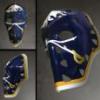
Bmwolf21 Posted January 5, 2007 Report Share Posted January 5, 2007 Nice. And courtesy of the folks in the sportslogos.net forums, here is a link to the ugliest hat ever. Ugh. Link to comment Share on other sites More sharing options...
shrader Posted January 5, 2007 Report Share Posted January 5, 2007 He was an orange jersey and a hideous purple jersey ranked at 7 and 8. The moral of the story here is who the hell cares what some other guy thinks. The only opinion that matters (in this kind of discussion anyway) is your own. And yes, that hat is horrible. Thank you reebok. You already killed NFL sideline hats, so it's time to take the logical next step. Link to comment Share on other sites More sharing options...
wjag Posted January 5, 2007 Report Share Posted January 5, 2007 Nice. And courtesy of the folks in the sportslogos.net forums, here is a link to the ugliest hat ever. Ugh. The crime isn't as much the color scheme as its the color scheme and they want 24 bucks for it!! Link to comment Share on other sites More sharing options...
LabattBlue Posted January 5, 2007 Report Share Posted January 5, 2007 Nice. And courtesy of the folks in the sportslogos.net forums, here is a link to the ugliest hat ever. Ugh. Somebody at Reebok should be fired for some of the hat designs they have come out with in recent years. I swear if they gave these out as a freebie at a game, I'd refuse it. Link to comment Share on other sites More sharing options...
will Posted January 5, 2007 Report Share Posted January 5, 2007 reminds me of zubaz. love that last paragraph in the link...never heard that phrase before. Link to comment Share on other sites More sharing options...
Orange Seats Posted January 5, 2007 Report Share Posted January 5, 2007 Hats are so terrible today. At least New Era has a bunch of classic designs. Link to comment Share on other sites More sharing options...
apuszczalowski Posted January 5, 2007 Report Share Posted January 5, 2007 And the slug is #1 where it counts, in the nhl standings Zubaz - "Crockpot for your pork"? How did these things ever go out of style? Link to comment Share on other sites More sharing options...
elcrusho Posted January 6, 2007 Report Share Posted January 6, 2007 hahahahahahhahahaha I love how he says... "Go Slugs!" Link to comment Share on other sites More sharing options...
JujuFish Posted January 6, 2007 Report Share Posted January 6, 2007 I'm no fan of the slug, but these uniforms aren't that terrible. At the very least they're better than the Anaheim, Atlanta and Nashville jerseys. I completely disagree, as far as logos are concerned. The jerseys themselves aren't bad. Link to comment Share on other sites More sharing options...
Pullup Champ Posted January 6, 2007 Report Share Posted January 6, 2007 Bunch of crackheads! :blink: This guy isn't ESPN... he is a freelancer... a wannabe... he writes an article every few months...usually after a bender. Notice the only uni's this guy likes? OLD GUY HOCKEY... Not OLD TIME Hockey... The best uniforms... the Habs? Really? Canadian team in USA colors...makes sense. :beer: then the Redwings followed by th Leafs -yawn. Figure it out. Only the newer jerseys are at the bottom, beacuse they are not MANLY...STUFF MY DAD GREW UP WITH...get over it. Got my jersey. Home. Drury. Took eight weeks because they are a hot item. Appearantly only losers in Buffalo rank them number 1. So I'm a loser...or so some chump on ESPN says so. :bag: Link to comment Share on other sites More sharing options...
Bmwolf21 Posted January 6, 2007 Report Share Posted January 6, 2007 Uhhhh....Terry Frei is a pretty accomplished writer - he is a regular contributor to ESPN.com and The Denver Post, as well as having written for The Sporting News, among others. You can check out his bio here. And as for the completely subjective rankings of the uniforms - there are things I might disagree with, but he is absolutely right on with some of the classic uniforms - the Habs, Red Wings, Rangers, and yes, even the Leafs, have strong, classic uniforms that don't look out-of-date. Really, in my eyes, there are three tiers of uniforms: the very good- to great; the solid/middle of the road unis, and then the horrible (and everyone else.) IMO, the Sabres' new uniforms are solidly in the middle - good design, great colors, and an below-average logo. Improve the logo and the Sabres would have one of the top new uniform designs in the league, IMO. Link to comment Share on other sites More sharing options...
Goodfella25 Posted January 6, 2007 Report Share Posted January 6, 2007 Nice. And courtesy of the folks in the sportslogos.net forums, here is a link to the ugliest hat ever. Ugh. Hahaha I saw someone walking into Great Skate today with that hat on! That thing should come packaged with clown shoes. Link to comment Share on other sites More sharing options...
Bmwolf21 Posted January 6, 2007 Report Share Posted January 6, 2007 Ahhh, Great Skate. I haven't been in there in years. Do they still do the summer tent sale with a handful of NHL stars coming in to sign autographs? Link to comment Share on other sites More sharing options...
imnotreallyscott Posted January 6, 2007 Report Share Posted January 6, 2007 Hahaha I saw someone walking into Great Skate today with that hat on! That thing should come packaged with clown shoes. That's a damn funny idea! Link to comment Share on other sites More sharing options...
Goodfella25 Posted January 6, 2007 Report Share Posted January 6, 2007 Ahhh, Great Skate. I haven't been in there in years. Do they still do the summer tent sale with a handful of NHL stars coming in to sign autographs? Yup and it always seems like they pick such random players...like last year I think we had DiPietro and somebody from the Bruins like Brad Boyes or something. Don't quote me on that but that's how random it seems. The tent sale is OK if you are looking to pick up some extinct jerseys or need some gear going into the fall/winter league season. I'd expect many, many Red and Black VINTAGE Sabres gear this year haha. Link to comment Share on other sites More sharing options...
Pullup Champ Posted January 6, 2007 Report Share Posted January 6, 2007 Uhhhh....Terry Frei is a pretty accomplished writer - he is a regular contributor to ESPN.com and The Denver Post, as well as having written for The Sporting News, among others. You can check out his bio here. And as for the completely subjective rankings of the uniforms - there are things I might disagree with, but he is absolutely right on with some of the classic uniforms - the Habs, Red Wings, Rangers, and yes, even the Leafs, have strong, classic uniforms that don't look out-of-date. Really, in my eyes, there are three tiers of uniforms: the very good- to great; the solid/middle of the road unis, and then the horrible (and everyone else.) IMO, the Sabres' new uniforms are solidly in the middle - good design, great colors, and an below-average logo. Improve the logo and the Sabres would have one of the top new uniform designs in the league, IMO. His mother wears Army boots..... :blink: Link to comment Share on other sites More sharing options...
Eleven Posted January 7, 2007 Report Share Posted January 7, 2007 Nice. And courtesy of the folks in the sportslogos.net forums, here is a link to the ugliest hat ever. Ugh. It's called the Reebok "Five-Hole Hat" for a reason. Beavis: I am Cornholio! I need a slughat for my fivehole! Are you threatening me? Link to comment Share on other sites More sharing options...
matter2003 Posted January 7, 2007 Report Share Posted January 7, 2007 Funny how it comes in 1st in jerseys sold by a landslide---so much so, they had to take our jerseys off nhl.com for a period because they ran out of stock.... Link to comment Share on other sites More sharing options...
MBD Posted January 7, 2007 Report Share Posted January 7, 2007 Another useless ranking. Why do people bother caring about these things? Link to comment Share on other sites More sharing options...
apuszczalowski Posted January 8, 2007 Report Share Posted January 8, 2007 Another useless ranking. Why do people bother caring about these things? Because its ammo for their arguements that the logo sucks and should be replaced. I'm sure Quinn will see this and immediately put in a change to go back to the old jerseys because a writer from ESPN thinks the uniform and logo sucks Link to comment Share on other sites More sharing options...
MBD Posted January 8, 2007 Report Share Posted January 8, 2007 Because its ammo for their arguements that the logo sucks and should be replaced. I'm sure Quinn will see this and immediately put in a change to go back to the old jerseys because a writer from ESPN thinks the uniform and logo sucks True, especially considering the jerseys have been soldout for months now. All that matters is some nobody's opinion. Money doesn't count. <_< Link to comment Share on other sites More sharing options...
apuszczalowski Posted January 8, 2007 Report Share Posted January 8, 2007 True, especially considering the jerseys have been soldout for months now. All that matters is some nobody's opinion. Money doesn't count. <_< yeah, but they are only selling them out because the originals aren't available so people spend $100's on a jersey they don't like only because its available. Apparently Quinn knows this and it was his plan all along to get people to buy the new ones. Its not possible that some people don't find them as deplorable as most posters here do Link to comment Share on other sites More sharing options...
Two or less Posted January 8, 2007 Report Share Posted January 8, 2007 YAWN...... So a dude who works for ESPN has an opinion bout our jerseys.... and we take it seriously?? LOL good joke guys. Link to comment Share on other sites More sharing options...
Recommended Posts
Archived
This topic is now archived and is closed to further replies.