Bmwolf21 Posted October 9, 2008 Report Share Posted October 9, 2008 LINK The Thrashers unveiled their new alternate uniforms during the 2008 Face Off Event on Wednesday, Oct. 8, at Philips Arena. The annual event, which is open to season ticket-holders, is a celebration of the start of the Thrashers 2008-09 Regular Season, which begins on Friday, Oct. 10, at Philips Arena when they host the Washington Capitals at 7:30 p.m. Sorry, couldn't save a pic from the site for some reason, but the link includes photos and a "Uniform Timeline" for comparison. Link to comment Share on other sites More sharing options...
shrader Posted October 9, 2008 Report Share Posted October 9, 2008 ouch Link to comment Share on other sites More sharing options...
SMIRNOFF Posted October 9, 2008 Report Share Posted October 9, 2008 That is just not nice to look at. Link to comment Share on other sites More sharing options...
carpandean Posted October 9, 2008 Report Share Posted October 9, 2008 The ONLY thing that I like about these is the color, which is really nice. Everything else is awful. The color would help their primary, though: Note: I also used the shoulder logo on the front. Link to comment Share on other sites More sharing options...
shrader Posted October 9, 2008 Report Share Posted October 9, 2008 It's like they're trying to go for a football look or something. I don't get it. Link to comment Share on other sites More sharing options...
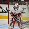
inkman Posted October 9, 2008 Report Share Posted October 9, 2008 Kovalchuck stills looks like a little boy. Link to comment Share on other sites More sharing options...
thesportsbuff Posted October 9, 2008 Report Share Posted October 9, 2008 I don't think it's all that bad. It's far from a classic look, but at least it's somewhat creative and not real similar to any other teams jersey. Doesn't touch the powder-blue home jerseys, but it's not the worst it could be. Link to comment Share on other sites More sharing options...
TM8-PL16 Posted October 9, 2008 Report Share Posted October 9, 2008 the socks are HORRIBLE!!!! absolutely the worst ever... The jersey is kind of cool I guess, but looks like a basketball jersey with sleeves. Not sure I like it. Link to comment Share on other sites More sharing options...
thesportsbuff Posted October 9, 2008 Report Share Posted October 9, 2008 the socks are HORRIBLE!!!! absolutely the worst ever... The jersey is kind of cool I guess, but looks like a basketball jersey with sleeves. Not sure I like it. Ouch, I didn't see the picture with the socks... yuck. Link to comment Share on other sites More sharing options...
nobody Posted October 9, 2008 Report Share Posted October 9, 2008 Just trying to show up the Sabres with their tiny front number. Link to comment Share on other sites More sharing options...
frisky Posted October 9, 2008 Report Share Posted October 9, 2008 Are they being sponsered by McDonald's? They look like the hockey version of a McDonald's uniform. All you need instead of C's and A's are the Golden Arches in their place. Link to comment Share on other sites More sharing options...
Goodfella25 Posted October 9, 2008 Report Share Posted October 9, 2008 Ugh, that jersey is crap. In other news, icethetics shows the Tampa Bay and Philadelphia 3rd jersey leaks...http://icethetics.blogspot.com/ I actually like Tampa's. Maybe it's just the color scheme that I like, plus "Lightning" is a good name for a hockey team. In this case, using "Bolts" diminishes that part of it. Link to comment Share on other sites More sharing options...
BetweenThePipes00 Posted October 9, 2008 Report Share Posted October 9, 2008 Man that is HORRIBLE ... You know, and this is a bit off-topic but ... it's as if the league thinks they can win new fans by changing the jerseys ... as if THAT was the problem. Fix the GAME. And if people in Atlanta/Miami/Phoenix don't want to support it, get out. Do they really think somehow crazy new designs and tighter jerseys so you can see the "individual shape" of players is going to all of a sudden make people buy tickets or watch more on TV? (Did anyone else hear that from Quinn, about how the old jerseys were "boxy" and Jason Pominville looked just like Jaro Spacek ... but NOW we can see they are different! Well then, problem solved! I'm sure NBC will be offering millions for the next TV deal as a result of Jaro's figure. Link to comment Share on other sites More sharing options...
inkman Posted October 9, 2008 Report Share Posted October 9, 2008 Did anyone else hear that from Quinn, about how the old jerseys were "boxy" and Jason Pominville looked just like Jaro Spacek ... but NOW we can see they are different! Well then, problem solved! I'm sure NBC will be offering millions for the next TV deal as a result of Jaro's figure. Glad I missed that. Painfully stupid. :wallbash: Link to comment Share on other sites More sharing options...
ROC Sabres Posted October 9, 2008 Report Share Posted October 9, 2008 U-G-L-Y YOU AINT GOT NO ALIBI, YOU UGLY, YA YA, YOU UGLY!!! The good thing that i see from their website is they had their 3rd jersey from 03-06 become their home jersey. Any other teams you think should probably do this? Link to comment Share on other sites More sharing options...
BetweenThePipes00 Posted October 9, 2008 Report Share Posted October 9, 2008 Glad I missed that. Painfully stupid. :wallbash: It's in here ... http://sabres.nhl.tv/team/console.jsp?catid=668&id=21489 ... I mean, I used to think the guy just spouted the NHL's company line about Reebok ... I think he really BELIEVES it ... Link to comment Share on other sites More sharing options...
Hawerchuk Posted October 9, 2008 Report Share Posted October 9, 2008 ATL = crap! At least Philly didn't mess with it much. Still that classic look, even though I friggin HATE that team! TB's are pretty good, although I don't like "BOLTS" across the front. Link to comment Share on other sites More sharing options...
MattPie Posted October 9, 2008 Report Share Posted October 9, 2008 Any other teams you think should probably do this? The article mentioned that 6 teams' jerseys were once the thrid jersey. At least there's a precedent! Link to comment Share on other sites More sharing options...
nobody Posted October 9, 2008 Report Share Posted October 9, 2008 Ugh, that jersey is crap. In other news, icethetics shows the Tampa Bay and Philadelphia 3rd jersey leaks...http://icethetics.blogspot.com/ I actually like Tampa's. Maybe it's just the color scheme that I like, plus "Lightning" is a good name for a hockey team. In this case, using "Bolts" diminishes that part of it. Agreed - TB's is a good looking jersey except for the Bolts part. The Flyers didn't do anything to screw up their jersey so well done. Link to comment Share on other sites More sharing options...
ROC Sabres Posted October 9, 2008 Report Share Posted October 9, 2008 The article mentioned that 6 teams' jerseys were once the thrid jersey. At least there's a precedent! I would be willing to guarantee that our 3rd jersey will blow out the sale of our CURRENT home jersey. Link to comment Share on other sites More sharing options...
Recommended Posts
Archived
This topic is now archived and is closed to further replies.