carpandean
-
Posts
9,220 -
Joined
-
Last visited
Content Type
Profiles
Forums
Events
Everything posted by carpandean
-
Marco Scandella/Jason Pominville traded to Sabres for Ennis/Foligno
carpandean replied to Brawndo's topic in The Aud Club
This ain't the NFL. -
Marco Scandella/Jason Pominville traded to Sabres for Ennis/Foligno
carpandean replied to Brawndo's topic in The Aud Club
Will Pommer be the first Sabres player to wear #92 (since McCabe has #29)? -
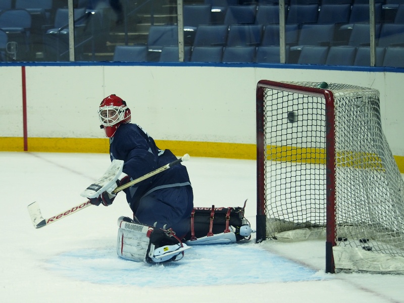
Austin is out, anyway, as he wasn't qualified today.
-
:flirt: (My picture. I don't shoot a puck that well.)
-
Wishing him lots of this ... (My shot from 2013 development camp.)
-
Expansion draft and league-wide wheeling and dealing
carpandean replied to Brawndo's topic in The Aud Club
Agreed. Every time I hear his name, I think of The Princess Bride ... https://youtu.be/X90qKQAMh8A?t=2m9s Hamonic ... Hamonic ... Hamonic, Hamonic, Hamonic, Hamonic! -
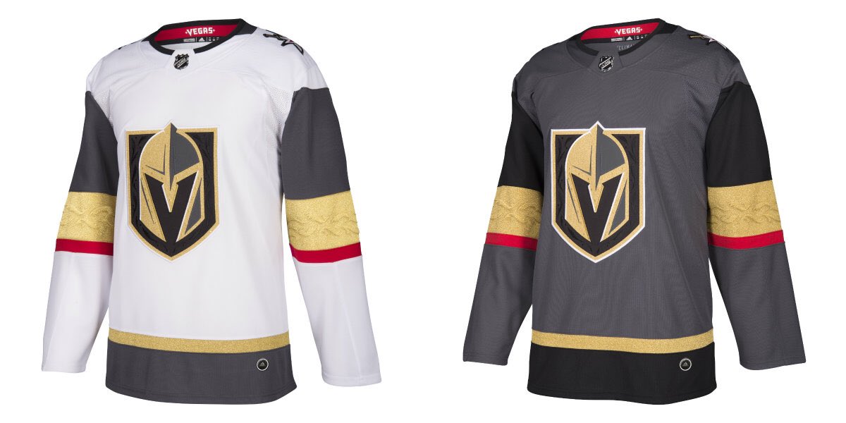
Everything Sabres Uniform Related - Royal Blue Please!
carpandean replied to CallawaySabres's topic in The Aud Club
Yes, I know ... :P -
Everything Sabres Uniform Related - Royal Blue Please!
carpandean replied to CallawaySabres's topic in The Aud Club
Just noticed that the Wild jersey got the Pathers' "wanna be Montreal" treatment: The Habs must be pissed. They've had that design exclusively since the Blackhawks dropped it in the late 1930's (except for their WC/3rd homage to the same.) Edit: don't get me wrong; it's a sharp looking jersey. -
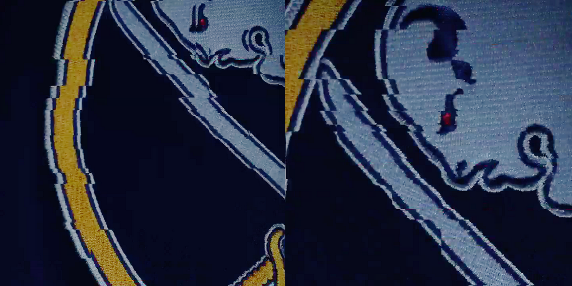
Everything Sabres Uniform Related - Royal Blue Please!
carpandean replied to CallawaySabres's topic in The Aud Club
Did you buy a game-worn WC jersey? They never sold the actual WC jerseys: What they sold as the WC jersey was just a throwback white. No laces on the collar. Not as dark blue. Those should be our home jerseys now. -
Everything Sabres Uniform Related - Royal Blue Please!
carpandean replied to CallawaySabres's topic in The Aud Club
Yup. I've been seriously thinking about buying a new jersey (I always buy the authentic "on ice" ones), but I can't see buying either. The whites are definitely out, but the blues are still not quite good enough (better, but not there yet.) -
Everything Sabres Uniform Related - Royal Blue Please!
carpandean replied to CallawaySabres's topic in The Aud Club
On further review, I think those may actually be the same shiny white that's under the NHL crest on the collar. Yes, they actually put white stripes on a white jersey just to thin out the only contrasting color. :doh: -
Everything Sabres Uniform Related - Royal Blue Please!
carpandean replied to CallawaySabres's topic in The Aud Club
:wallbash: :wallbash: :wallbash: :wallbash: :wallbash: :wallbash: :wallbash: :wallbash: :wallbash: -
Everything Sabres Uniform Related - Royal Blue Please!
carpandean replied to CallawaySabres's topic in The Aud Club
Oilers switched to orange, but also changed accent color from royal to navy: https://static1.squarespace.com/static/5007b2ea84aef6ab9cd08134/t/5944a9812cba5e0fcda5400a/1497672078467/?format=500w Someone at Adidas not like royal? -
Everything Sabres Uniform Related - Royal Blue Please!
carpandean replied to CallawaySabres's topic in The Aud Club
https://www.nhl.com/sabres/news/nhl-adidas-unveil-new-uniforms/c-290017052 Appears to be white half stripes. -
Everything Sabres Uniform Related - Royal Blue Please!
carpandean replied to CallawaySabres's topic in The Aud Club
So, despite removing all of the other silver, the outer two stripes are still split (can't tell if they're silver/gold or white/gold.) If they left the striping on the aways the same (i.e., splitting the outside blue stripes, such that there's almost no contrast with the white), I'll be pissed. If they swapped the waist stripes, like the original home whites, then split the outside gold stripes instead, I won't be as mad. -
Everything Sabres Uniform Related - Royal Blue Please!
carpandean replied to CallawaySabres's topic in The Aud Club
-
Everything Sabres Uniform Related - Royal Blue Please!
carpandean replied to CallawaySabres's topic in The Aud Club
That would be a big step forward. Then, a royal blue WC jersey, which becomes a third and finally becomes their homes for the 50th! It's all coming together, MUAH-HA-HA! :devil: -
Everything Sabres Uniform Related - Royal Blue Please!
carpandean replied to CallawaySabres's topic in The Aud Club
From the latest Adidas teaser ... While it continues to show that royal blue is not coming back yet, there is one positive thing to note. The outline on the logo, which I know many would prefer to drop, is clearly WHITE, not silver. This is a good indication that the silver will be gone. Baby steps ...
-
Unless it's followed by -tiful.
-
Calvin Pickard shows up as 50GP 0.922 SV% when you are picking, but in your final list, he has the correct 0.904 SV%. Looking back, he had a 0.922 S% in 20GP in 2015-16, then dropped to the 0.904 in 50GP last year. His career SV% is 0.914. Edit: Similarly, Mrazek shows his 2015-16 SV% (0.921 in 54GP) while picking, but his 2016-17 (0.901 in 50GP) in the final list. I'm too lazy to look at a bunch more, but I wonder if there listed stats are 2015-16 for everyone while picking.
-
Everything Sabres Uniform Related - Royal Blue Please!
carpandean replied to CallawaySabres's topic in The Aud Club
That has to be a joke ,right? I'm stupid. Just realized which game they're talking about and where it will be played. This headline would have helped. :blush:
-
Everything Sabres Uniform Related - Royal Blue Please!
carpandean replied to CallawaySabres's topic in The Aud Club
Perhaps, they are just messing with us. The Adidas jerseys will look basically like the current Reebok ones. Then, for the Winter Classic, a new royal blue jersey will be released. Then, in a year or two, they will switch to it and a white version, thereof. It could happen ... -
Ever seen one of those movies where a team of bad guys comes into a competition and cheats and takes cheap shots to win? There's always a scene with that team celebrating winning in the middle, while all around them, people are looking at them angrily. That's what it's like when a team wins the Cup on the road. I hate it.
-
I agree (especially after they didn't win games 1 and 2, so they couldn't win the series in four.) Of course, if that's what games 3 and 4 went for, how much will game 6 go for if they win game 5? I wouldn't even look, as it would be too tempting and there's no way that I'd want to miss a possible.series clincher (or even a must-win to force game 7.)
-
Everything Sabres Uniform Related - Royal Blue Please!
carpandean replied to CallawaySabres's topic in The Aud Club
Meh. It's a good logo, but not for a team called the Sabres. It would make more sense for the Bisons. The red third's logo was more appropriate.