
IKnowPhysics
-
Posts
7,316 -
Joined
-
Last visited
Content Type
Profiles
Forums
Events
Posts posted by IKnowPhysics
-
-
Respectfully, not only no, but hell no.
In order to receive critically necessary league revenue sharing, the team needs to develop and execute plans that project increased team revenue, and the league simply won't accept a plan in which average ticket prices go down.
The Sabres might throw all sorts of giveaways and merchandise discounts and concessions discounts and special events and 50/50 raffles and other incentives at STHs, and they might even change what STHs pay for seats in different sections, but there's basically a zero percent chance that the average STH price decreases.
Especially after the team and league revenue losses of Covid.
-
 2
2
-
 1
1
-
 1
1
-
 1
1
-
-
3 minutes ago, nfreeman said:
It's not without risk, but no contract is.
I think it's a great deal for the Sabres.
And I think Dahlin will sign for an AAV in the nines.
We should be ecstatic if Dahlin's contract stays in the nines. Karlsson's 11.5 and Doofy's 11. The other top eight are all 9-10. After this year, we'll be lucky to keep Dahlin for <10, and it'd be a miracle to get him <9. Dahlin for 8.5 would get Adams GMOTY.
-
Just now, Norcal said:
Although I wonder what happened to the bridge deal in hockey and woulda liked a few more years at team control for a little less money
Only to absolutely get soaked salary/cap wise after that bridge deal and that's if he even agrees to sign in Buffalo?

-
 1
1
-
 1
1
-
-
Quote
5 Team No Trade Clause in years 5-7
Covers 3 UFA years

-
Sabres' actual second line center Tyson Jost:

-
2
-
-
9 minutes ago, DarthEbriate said:
Leaving money on the table. Why doesn't anyone want to get paid anymore? The cap is about to skyrocket: someone bet on yourself.

-
6
-
1
-
-
17 minutes ago, Thorny said:
The Dahlin effect cannot be ignored, ever
He’s That Guy
True. Dahlin's putting up 0.57 5v5 iG/60, 3rd in the league. Next best Sabres D is 0.13. Primary assists are 0.63 (13th in league) vs Power's 0.39. You either get that extra half goal and assist per game on your shift or you don't.
-
 1
1
-
-
Away from the math, Quinn might be my favorite player on the team right now. His vision, passing, stick handling, shooting, creativity, and awareness are all fantastic and fun to watch. Especially his creativity- this kid is smart. His footspeed needs work to become elite, as does his tenaciousness defending the opposing puck carrier. But damn is it fun to see him work in space in the offensive zone.
-
3 minutes ago, Taro T said:
Nice analysis. Hoping you're right and that whole crew is on the verge of breaking out.
Personally view it in simpler terms. (Which by definition misses a fair amount of nuance.) They've gotten tougher matchups since Mittelstat's line got bumped & eventually converted to Jost's line. They'll break through soon, as they get a smidge better. But getting Jost's line treated as the 2 could be the difference between the Kids breaking out and truly tearing it up.
Respectfully, the usage charts haven't showed a significant difference in quality of competition for any of the lines. There's been a little bit of zone start play (Skinner/Thompson/Tuch in the Ozone and Okposo-Girgensens in the Dzone), but the kids haven't been subjected to that. I think the rise of Mitts-Jost-Olofsson has helped the team tons of ways, but I don't think it's hurt the kids... except...
What I do think may have changed is the defense. Before and after new year's, the ratio of Cozens' time split among defensive pairs has changed:
Dahlin 40% -> 26%
Power 43% -> 39%
Lyubushkin 17% -> 35%
So the kids have been playing with the 3rd pair D twice as much as they used to, and most of it came out of their Dahlin time.
-
1
-
-
- Popular Post
- Popular Post
It's easy to look at Quinn's game log and see that he had 6G 11A in 28GP before new year's and then 2G 1A in the 14GP since then, and think he's stalling or he's inconsistent.
However, while his iG/60 dipped from 0.9 to 0.79 from then to now, his ixG/60 and iCF/60 have both gone up. He's actually creating more and better chances. So what's really going on? What's changed? Let's scan the stats. The first number is from the beginning of the season up to new year's day. The second number is since then.
- CF/60 55.63 -> 58.70 (no change)
- CA/60 52.02 -> 55.93 (no change)
- GF/60 3.97 -> 1.98 (big drop in actual goals for)
- GA/60 3.07 -> 1.98 (big drop in actual goals against)
- xGF/60 3.19 -> 3.13 (no change in expected goals for)
- xGA/60 2.43 -> 2.54 (no change in expected goals against)
- HDCF/60 13.19 -> 14.28 (not much change)
- HDCA/60 9.03 -> 11.50 (not much change)
- Giveaways/60 1.45 -> 1.59 (no change)
- Takeaways/60 1.81 -> 2.78 (huge improvement)
Three things stand out.
- The offense of his line (xGF/60) is steady, but pucks aren't going in (GF/60). But his individual offense (ixG/60) is up and his individual goal scoring (iG/60) hasn't dropped that much. The high danger offense number (HDCF/60) haven't changed. His giveaways aren't changing. It might be someone else's fault. Let's come back to this.
- The defense of his line (xGA/60 and HDCA/60) is steady, but they are being scored against much less (GA/60). My money's on better goal tending or better performance from defense behind them.
- He's getting more engaged on defense. His takeaways are wayyy up. We see this also with Cozens (1.45 -> 2.24) and Peterka (0.96 -> 1.53). This is a Don-Teaches-the-Fundamentals outcome: the kids are improving their individual man-on-man defense and becoming better fundamental hockey players.
But why aren't the pucks going in? One note is that his linemates are giving the puck away a little more. Peterka's giveaways/60 are way up (0.83 -> 1.91). Cozens' are up slightly (0.58 -> 0.75). Let's check the rest.
Cozens
- CF/60 57.25 -> 55.65 (no change)
- CA/60 55.37 -> 57.37 (no change)
- iG/60 1.01 -> 0.75 (down a bit)
- ixG/60 1.10 -> 0.92 (no change)
- iCF/60 14.17 -> 13.45 (no change)
- GF/60 3.47 -> 1.49 (down a good bit; these line stats are similar to Quinn)
- GA/60 3.61 -> 1.87 (down a good bit; these line stats are similar to Quinn)
- xGF/60 3.02 -> 3.25 (very good, now 2nd on team)
- xGA/60 2.72 -> 3.09 (not much change)
- HDCF/60 12.14 -> 13.82 (not much change)
- HDCA/60 11.42 -> 16.06 (suddenly worst on team)
Peterka
- CF/60 54.32 -> 62.35 (up quite a bit)
- CA/60 53.35 -> 66.48 (up quite a bit)
- iG/60 0.96 -> 0.00 (obviously down a lot)
- ixG/60 0.69 -> 0.78 (up a little bit)
- iCF/60 12.38 -> 15.3 (up a little bit)
- GF/60 3.44 -> 1.53 (down a good bit, same as Cozens and Quinn)
- GA/60 3.3 -> 2.29 (down a good bit, same as Cozens and Quinn)
- xGF/60 2.9 -> 3.41 (suddenly up and now leads team; this is phenomenally high, approx 37th in the league over the same period for regular forwards)
- xGA/60 2.69 -> 2.47 (not much change)
- HDCF/60 12.51 -> 14.15 (not much change)
- HDCA/60 11.55 -> 12.24 (not much change)
It looks like Cozens is sacrificing high danger chances against (HDCA/60) a bit in favor of what should be all three players getting blistering amounts of expected goals for (xGF/60). And that's in addition to the higher giveaways by Cozens and Peterka. Because actual GA/60 is down, the increased reliance on goaltending is working for now. But the expected goals-for haven't been finding the back of the net.
I'm almost positive this line is in a dam-is-ready-to-burst condition. I expect a breakout game or games coming for one or all three players. The fact that Peterka has elite offensive production with zero goals in absolutely unsustainable.
-
7
-
3
-
3
-
4 hours ago, LGR4GM said:
I wasn't going to make a thread but a know there was talk a while back that Pekar was going to be some 3/4 line guy for Buffalo because in this one training camp he hit Dahlin so here we are.
So a common reassignment wasn't thread worthy, but a petty, vaguely-targeted I-told-you-so definitely was.

-
3
-
1
-
-
I believe this:
6 minutes ago, #freejame said:chance our PR team played as much a role in this as Dahlin.
More than this:
47 minutes ago, GASabresIUFAN said:a subtle plea by Dahlin for management to make a move or two to help the team make the playoff?
Full tin foil hat: At most this was the team asking Dahlin to write a letter about all sorts of things and to plug attendance along the way.
But players do notice attendance. They feel the energy when the building's rocking. They're playing good hockey, and they're ready for the fans to buy in.
-
3
-
-
32 minutes ago, LGR4GM said:
For all of the Tuch or Cozens for captain talk, all I can say is it will be Rasmus Dahlin when everything is said and done.
Here's 2 minutes of Dahlin shooting. He's a wizard and Ralph Krueger is Voldemort.
When fans, scouts, etc talk a lot about how good a player is, often times things like puck handling and speed come up. But there's two foundational elements here that are
combiningbeing used at an elite level to unlock a special ability to make moves like this.- Dahlin's puck handling ability without looking at the puck is incredible. He maintains total control of the puck through these plays.
- Dahlin's edge work is world-class. His ability to accelerate, change direction, generate speed while pivoting is exceptionally good.
The special ability unlocked is that he gets to read the opponents' hips. Watch each of those plays. Every defender that comes his way to challenge his possession, he reads the direction their hips are pointed, and he goes the opposite way. If he couldn't hold on to the puck like that (or couldn't do it without looking at the puck), he wouldn't have the vision required to read opponents' skating like that. If his edges didn't give him the ability to out-maneuver the opponent, he wouldn't be able to achieve the open lanes.
It's such a simple thing: opponent is going one way, so I'll go the other. It even looks easy. But the skill required to enable that and have it be effective against top NHL opponents is what makes it wizardry.
-
3
-
On 1/25/2023 at 11:39 AM, IKnowPhysics said:
Over the past ten games, the stats indicate that Mittelstadt, et al, is producing offense (CF/60, GF/60, etc) at a 2nd line-like rate, which is fantastic. ...quality hockey from the "bottom six" like this helps take pressure off the kids.
A little more on this. For all NHL forwards with 10GP:
Top 96 (3 x 32) forwards in P/GP score 0.77P/GP or more. Middle of ths range would be rank 48th. This includes:
- Thompson 1.42 (6th)
- Tuch 1.13 (23rd)
- Skinner 1.11 (25th)
- Cozens 0.90 (57th)
Top 192 (6 x 32) forwards in P/GP score 0.49P/GP or more. Middle of this range would be rank 144th. This includes:
- Olofsson 0.60 (147th)
- Mittelstadt 0.58 (152nd)
Top 288 (9 x 32) forwards in P/GP score 0.35P/GP or more. Middle of this rank would be 240th. This includes:
- Quinn 0.46 (210th)
- Okposo 0.46 (210th)
- Hinostroza 0.42 (239th)
- Peterka 0.41 (244th)
- Jost 0.40 (280th)
Asplund 0.32, Krebs 0.30, and Girgensens 0.22 round out the Sabres forwards.
Summary: Production wise, we have three exceptional first liners plus a standard 1st line center in Cozens (this is brilliantly good). Olofsson and Mittelstadt produce like standard 2nd liners (also amazing considering the struggle over the season). Not counting Vinny, we have three average-to-good third line-like production in Quinn, Okposo, and JJ.
It's no shock that Quinn and Peterka need veteran support to develop, but they way Cozens, Mittelstadt, and Olofsson are producing underneath the top line is definitely helping get the team wins and taking the pressure off of them.
-
6
-
On 1/21/2023 at 3:24 PM, K-9 said:
Eichel gonna get yet another coach fired.
Jack "I Kill" Coaches
-
1
-
-
-
2 hours ago, Brawndo said:
No changes
 2 hours ago, Mustache of God said:
Comrie

For real though, I hope he plays well given a healthy team in front of him. Most of his ***** stats are from when we had four D injured.
-
2
-
-
On 1/18/2023 at 6:08 PM, Doohickie said:
Why does this thread still exist?
-
2
-
-
Over the past ten games, the stats indicate that Mittelstadt, et al, is producing offense (CF/60, GF/60, etc) at a 2nd line-like rate, which is fantastic. But what's even better is that they're crushing the opponent in xGA/60. This has resulted in Mittelstadt, Jost, and Olofsson leading the forwards in xGF% around 60%, which is not just strikingly good for this team...
It's critical in order for Granato's line tactics to work. Player usage charts show that we don't line match skill-vs-skill or shutdown-vs-skill. We play some zone starts (ie, putting out Skinner-Thompson-Tuch in the offensive zone), but we're not line-matching. Granato rolls four lines. Mittelstadt-Jost-Olofsson a month ago was considered to be a dreadful result of all of the other lines working well.
Granato's good coaching and the players' hard work have improved a once-upon-a-time all-is-lost 4th line into a transformative line 2A. Additionally, quality hockey from the "bottom six" like this helps take pressure off the kids.
-
3
-
2
-
-
3 minutes ago, Weave said:
Do you like fish sticks?
-
-
5 hours ago, dudacek said:
Oh my god, this thread is hilarious.
Kim’s illness has left a vaccuum at the top of the business side for an extended period.
This guy is filling the gap.
Why does it need to be anything more?
But what about ***** space aliens?

-
3 hours ago, That Aud Smell said:
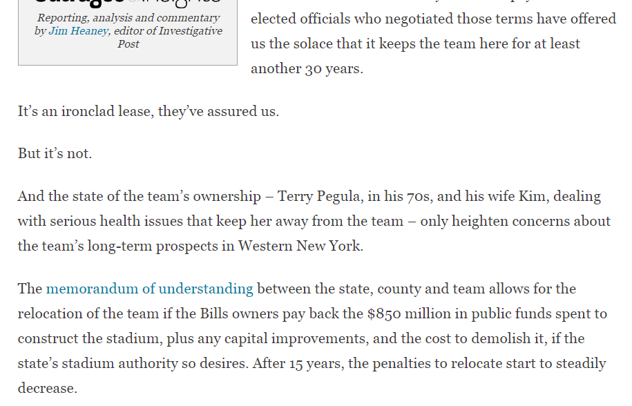
Terry’s age and Kim’s uncertain health would seem to increase the risk of the Bills’ being relocated by a new owner. Especially if the new lease doesn’t do enough to prohibit or discourage the same.
3 hours ago, That Aud Smell said:Kim’s prognosis and plans for (capacities in) the future are relevant to the future of the Bills in Buffalo. “Gross,” maybe. But those are the facts, imo.
It's enough to say that the Bills' location in WNY and the public interest need to be protected in the event of the owners' death and that the public money agreements need to effectively account for that scenario. Full stop.
QuoteWhat kind of shape are Terry – and especially, Kim – really in and what is their prognosis for the long term?
These are not academic questions. Answering them is required due diligence if the interests of taxpayers and fans are to be respected.There is no ***** reason why anyone should be calling for public inquiry about details of Kim's health, let alone insinuating that failure to do so would disrespect taxpayers or fans.
-
1
-
-
36 minutes ago, That Aud Smell said:
I continue to wish Kim Pegula well in her recovery.
This recent Investigative Post report on the MOU for the new stadium lease points to the valid reasons that members of the public - a public that is footing the $850M bill - may want to know more about Kim's prognosis.
https://www.investigativepost.org/2023/01/16/bills-new-stadium-lease-is-not-ironclad/
That article is gross.
You want an iron-clad way to keep the Bills in WNY if they use public funds for stadium construction? Fine. You want to compel an individual to release their private medical information because you want more ammunition to motivate the state/county to negotiate a more iron-clad way to keep the Bills in WNY? Gross.
-
 1
1
-
1
-
1
-
1
-


What is the primary reason you visit this board?
in The Aud Club
Posted
While the message board format is antiquated and grants no preference to user-defined higher quality content, it allows serial long form comment chains, which can, in some instances, enable deeper meaningful discussion.
Also gifs