

LouBrawls
-
Posts
71 -
Joined
-
Last visited
Content Type
Profiles
Forums
Events
Posts posted by LouBrawls
-
-
38 minutes ago, Swedish Bikini Team said:
retail authentics and game worn jerseys were basically the same. Same shape and weight while both were made in Canada.
TheI Indo-Edge was Reeboks retail authentic made in Indonesia, not Canada , starting in 2011. They had the lime green neck tape on the inside.
-
7 hours ago, Brawndo said:
@LouBrawlsYou are correct sir
This is very short sighted and the person responsible for it should suffer some consequences.
Just business 101. curious if the 2400 is total across all accounts or just the SS. My guess is all accounts.
-
-
4 hours ago, Getpucksdeep said:
Is this the pro weight?
Yes, It's the Authentic jersey. Buy that and have the Sabres Store customize.
A true pro weight jersey are the made in canada jerseys the players wear, those are not sold at retail.
-
9 minutes ago, Brawndo said:
The rumor is it’s an Adidas Decision and the replicas are the only ones they will stock going forward
False, that's not how things work. If they run out, then that's on the Sabres Store for not buying enough of them. A company would never withhold product if they have extra inventory. They only make as many jerseys as they have orders for from all their accounts. If the Sabres Store only ordered 100 jerseys, then that's all they get.
The buyer for the Sabres Store may have under estimated the response and demand to the 50th. It's been the same guy running it forever, so you'd think he'd know by now that these things blow out.
-
 1
1
-
-
Reddit NHL Streams.
-
 2
2
-
-
2 hours ago, triumph_communes said:
can someone post a photo of the dhgate ones after they've received? Not willing to buy until I see the stitching
Not mine but others have posted. This is a chinese knockoff.
-
they don't have a website but the OneBuffalo website acts as their online retail, kinda weird since most people don't make this connection.
They need to do a better job of communicating this or simplifying it for people, it's not rocket surgery.
-
3 minutes ago, sodbuster said:
In my opinion, navy looks better with the metallic gold.
Agreed. The royal doesn't have enough contrast and would wash it all out.
-
1 hour ago, Brawndo said:
a Buffalo connection, cool.
-
31 minutes ago, WildCard said:
Why does he have black pants on?
On April 6 2003, the Sabres wore the classic blue/gold against the Devils in the final home game of the season.
The players were not aware of it until they came back into the dressing room after warm ups. So when they skated back out wearing the jersey and socks the place erupted.
-
2
-
-
That has to be one of the laziest sites I’ve ever seen. Logos are crooked or off centered. When they put them on hoodies they don’t even bother masking off the laces, they just plunk it overtop. Lazy design work and dont get me started on the kids “designing” things. SMH
If you want to run a top notch organization, then everything needs to be attended too across the board. No matter how small, attention to detail. This a good example of mediocrity wins, “it’s good enough” mentality.
-
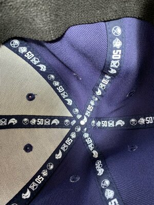
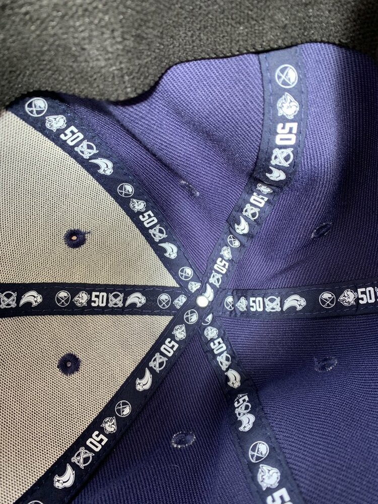
2 minutes ago, Taro T said:
Not exactly. The Goatheads & the Butter knives are both on the ribbon liner. But the Butter knives aren't on the new graphic.
crap you're right - I was thinking they left it off. No I am confused - no consistency
-
 1
1
-
-
3 hours ago, CallawaySabres said:
The guy who does all this was in my class in highschool and his first project was the slug. He showed it to me before it was revealed and all I remember saying to him was "what is that and where are the legs"?! I was so pissed off and told him I thought it was awful.
I can only pray that the royal blue is not some new creation but time after time, they have totally screwed it up. They will get the money grab with the 3rd jersey this year and then do it all over again next year with the royal blue
This is the designer of the Slug
http://hockeybydesign.com/2012/06/hbd-interviews-kris-bazen-the-buffaslug/
-
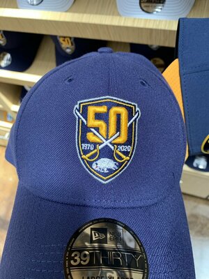
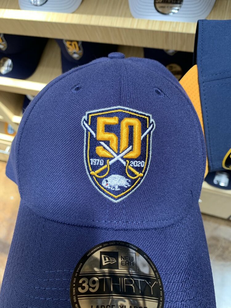
I don't see the confusion, they've only had 4 primary logos in their 50 yr history, that's all their referencing. Matches with the inside trim of the caps seen at the Sabres Store.
You could argue that the original and the current are the same logo, with a lot of extra silver outlines. The Butterknives was only a 3rd jersey logo. You can make a case for it being a 5th logo but honestly, it's semantics. I don't think they're trying to define each decade, so it makes sense to me.-
2
-
-
2 hours ago, Hoss said:
Hopefully a new design. The original design is pretty but we've seen it before and it's basically a boring stock template of hockey jerseys. Get creative. But also don't ***** it up. No pressure.
Anything short of being the original uniforms in royal blue will blow gaskets and be a big disappointment for 99% of the fanbase.
-
Found in the Sabres store. I lifted the images from twitter.
-
1
-
New Gold Alternate 3rds
in The Aud Club
Posted
I'm hearing conflicting reports the arena store is sold out Adidas 50th jerseys. I know a couple local stores have them and quantities online are slim at NHL shop, cool hockey and ice jerseys. Anyone go to the game last night and can clarify?