Sabres Fan in NS Posted August 10, 2020 Report Share Posted August 10, 2020 3 minutes ago, New Scotland (NS) said: It's stupid, so might as well do it at the most stupid time, eh. Stupid me thought I was in the draft lotto redo nonsense thread. Royal Blue aint that stupid. Carry on ... Quote Link to comment Share on other sites More sharing options...
Marvin Posted August 10, 2020 Report Share Posted August 10, 2020 59 minutes ago, DaveSnuggerud said: Gotta start somewhere. 2 Quote Link to comment Share on other sites More sharing options...
steveoath Posted August 10, 2020 Report Share Posted August 10, 2020 16 minutes ago, WildCard said: Anyone else think 9am is a weird announcement time for this? Figured they'd want a more prime time Must be going for the European markets. ? Quote Link to comment Share on other sites More sharing options...
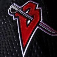
shrader Posted August 10, 2020 Report Share Posted August 10, 2020 1 hour ago, PASabreFan said: The icethetics graphic says it'll be based on the WC logo without the NY. Just wondering what was special about that logo. They're probably not aiming more broadly than the Buffalo audience and going with the most recent time that logo was used. Quote Link to comment Share on other sites More sharing options...
Brawndo Posted August 10, 2020 Author Report Share Posted August 10, 2020 1 hour ago, WildCard said: Anyone else think 9am is a weird announcement time for this? Figured they'd want a more prime time Could be a couple reasons, the NHL probably doe not want interference with the playoffs starting tomorrow night. Plus it gives them 3 hours of radio and TV Exposure. They’ll have the last hour of Howard Simon Show and two hours of the Instigators to discuss it, before yielding to football. They will probably have Kevyn Adams or Eric Bodamer on to discuss it. 1 Quote Link to comment Share on other sites More sharing options...
Ruff Around The Edges Posted August 10, 2020 Report Share Posted August 10, 2020 1 hour ago, WildCard said: Anyone else think 9am is a weird announcement time for this? Figured they'd want a more prime time Maybe Terrance has nap time during the day, get it in and over with before such time Quote Link to comment Share on other sites More sharing options...
inkman Posted August 10, 2020 Report Share Posted August 10, 2020 1 hour ago, WildCard said: Anyone else think 9am is a weird announcement time for this? Figured they'd want a more prime time You're acting like any of these jackwads have a ***** clue. 3 Quote Link to comment Share on other sites More sharing options...
Taro T Posted August 10, 2020 Report Share Posted August 10, 2020 2 hours ago, PASabreFan said: The icethetics graphic says it'll be based on the WC logo without the NY. Just wondering what was special about that logo. Thick white embroidered stitching around the outline of Buffalo which was/is unique for that game. The grips of the saber were embroidered in a zip zag pattern making the spiral of the handle more apparent than in past versions where the straight line behind the spiral is also included. Also, the speed swishes are thinner and with more thickness at the lead than the tail like the "official" logo was set up way back when but rarely translated onto the actual sweaters. Those were the main differences from a quick perusal of both the original 70's - 90's vintages & 2nd winter classic sweaters. 1 Quote Link to comment Share on other sites More sharing options...
LGR4GM Posted August 10, 2020 Report Share Posted August 10, 2020 2 hours ago, IKnowPhysics said: Hairy Buffalo is dope AF. I would love to see that carried forward. It is the best thing to happen to our logo ever. Quote Link to comment Share on other sites More sharing options...
spndnchz Posted August 10, 2020 Report Share Posted August 10, 2020 15 hours ago, ubkev said: Burger King does suck Thx for the relevance. Quote Link to comment Share on other sites More sharing options...
IKnowPhysics Posted August 10, 2020 Report Share Posted August 10, 2020 39 minutes ago, LGR4GM said: It is the best thing to happen to our logo ever. Thinking back carefully about allof the crest iterations and detail changes, this could ultimately be correct. I really do like the modernization update from the 1994 logo to 2010, minus the choice of navy over royal and the continuance of gray. But this is a logo feature addition that really adds to the crest some visual depth, flash, and a feeling of regality without taking anything away at all; there's no downside or regret. And I don't think you can say that about any logo except the original. And you don't have to change signage or images or trademark patents. You limit the change to only jerseys -on the players and on the fans- for a cool sense of exclusivity. Quote Link to comment Share on other sites More sharing options...
Brawndo Posted August 10, 2020 Author Report Share Posted August 10, 2020 2 Quote Link to comment Share on other sites More sharing options...
Brawndo Posted August 10, 2020 Author Report Share Posted August 10, 2020 1 1 Quote Link to comment Share on other sites More sharing options...
Randall Flagg Posted August 10, 2020 Report Share Posted August 10, 2020 15 minutes ago, Brawndo said: Fun. 8 minutes ago, Brawndo said: I know a guy who works with some sports clothing brand here, hes seen them too and says the same thing. 1 Quote Link to comment Share on other sites More sharing options...
Andrew Amerk Posted August 11, 2020 Report Share Posted August 11, 2020 18 minutes ago, Randall Flagg said: Fun. I know a guy who works with some sports clothing brand here, hes seen them too and says the same thing. well, that’s good that they’ve nailed two jerseys in a row. Now how about fixing the product on the ice? Quote Link to comment Share on other sites More sharing options...
Doohickie Posted August 11, 2020 Report Share Posted August 11, 2020 2 hours ago, spndnchz said: Thx for the relevance. Thx for relevantly pointing out the irrelevance. Quote Link to comment Share on other sites More sharing options...
LabattBlue Posted August 11, 2020 Report Share Posted August 11, 2020 ...not going to make STH all of a sudden change their mind on their renewal. Quote Link to comment Share on other sites More sharing options...
IKnowPhysics Posted August 11, 2020 Report Share Posted August 11, 2020 2 hours ago, spndnchz said: Thx for the relevance. 26 minutes ago, Doohickie said: Thx for relevantly pointing out the irrelevance. 1 1 Quote Link to comment Share on other sites More sharing options...
dudacek Posted August 11, 2020 Report Share Posted August 11, 2020 (edited) I’m getting the sense that it will be the originals with some subtle variations that echo the variations of the 50th. Unlike the rest of you bitter old men, I already have my wallet open. Been saving 26 for this one. Edited August 11, 2020 by dudacek 1 Quote Link to comment Share on other sites More sharing options...
LabattBlue Posted August 11, 2020 Report Share Posted August 11, 2020 1 minute ago, dudacek said: Unlike the rest of you bitter old men. I resemble that remark. ? 1 1 Quote Link to comment Share on other sites More sharing options...
IKnowPhysics Posted August 11, 2020 Report Share Posted August 11, 2020 15 minutes ago, dudacek said: Been saving 26 for this one. A fine choice. I went with 26 the draft year and 9 the 50th Anniversary. Debating my next move... 23... 53... 19... or do a wait-and-see... Cozens... 10... free agent 2C... or the ever classic 74. Quote Link to comment Share on other sites More sharing options...
WildCard Posted August 11, 2020 Report Share Posted August 11, 2020 (edited) 25 minutes ago, dudacek said: I’m getting the sense that it will be the originals with some settle variations that echo the variations of the 50th. Unlike the rest of you bitter old men, I already have my wallet open. Been saving 26 for this one. 15 for me. 15 in blue, 26 in white, maybe Cozens or whomever steps up in alternate Edited August 11, 2020 by WildCard Quote Link to comment Share on other sites More sharing options...
darksabre Posted August 11, 2020 Report Share Posted August 11, 2020 1 hour ago, dudacek said: I’m getting the sense that it will be the originals with some subtle variations that echo the variations of the 50th. Unlike the rest of you bitter old men, I already have my wallet open. Been saving 26 for this one. At least they let you change the nameplate on the back after the guy gets traded 1 Quote Link to comment Share on other sites More sharing options...
Doohickie Posted August 11, 2020 Report Share Posted August 11, 2020 2 hours ago, dudacek said: Unlike the rest of you bitter old men, 1 Quote Link to comment Share on other sites More sharing options...
PASabreFan Posted August 11, 2020 Report Share Posted August 11, 2020 14 hours ago, Taro T said: Thick white embroidered stitching around the outline of Buffalo which was/is unique for that game. The grips of the saber were embroidered in a zip zag pattern making the spiral of the handle more apparent than in past versions where the straight line behind the spiral is also included. Also, the speed swishes are thinner and with more thickness at the lead than the tail like the "official" logo was set up way back when but rarely translated onto the actual sweaters. Those were the main differences from a quick perusal of both the original 70's - 90's vintages & 2nd winter classic sweaters. This is how you do it, chumps. Quote Link to comment Share on other sites More sharing options...
Recommended Posts
Join the conversation
You can post now and register later. If you have an account, sign in now to post with your account.