Brawndo Posted December 26, 2018 Report Share Posted December 26, 2018 BUFFALO SABRES 2019 THIRD JERSEY: Expected. Buffalo is in the mix for a third jersey in 2019-20. Could it finally be the royal blue throwback fans have been begging for? 50TH ANNIVERSARY: The Sabres will turn 50 in 2020, so the question is whether the team will mark the milestone anniversary in 2019-20 or 2020-21. I haven’t seen anything definitive yet. (For what it’s worth, they marked their 40th in 2010-11 along with the Canucks. But they Canucks have already made plans to celebrate their 50th in 2019-20. So take that however you choose.) https://www.icethetics.co/jerseywatch/ Quote Link to comment Share on other sites More sharing options...
Sabres Fan in NS Posted December 26, 2018 Report Share Posted December 26, 2018 (edited) Why is there even a debate. The first season was 1970/71, so the 50th will be 2020/21. The Vancouver folks are just, so, I don't know, Canadian? Edited December 26, 2018 by New Scotland (NS) and ... I will believe the Royal Blue when I see it ... 1 Quote Link to comment Share on other sites More sharing options...
Taro T Posted December 26, 2018 Report Share Posted December 26, 2018 39 minutes ago, Brawndo said: BUFFALO SABRES 2019 THIRD JERSEY: Expected. Buffalo is in the mix for a third jersey in 2019-20. Could it finally be the royal blue throwback fans have been begging for? 50TH ANNIVERSARY: The Sabres will turn 50 in 2020, so the question is whether the team will mark the milestone anniversary in 2019-20 or 2020-21. I haven’t seen anything definitive yet. (For what it’s worth, they marked their 40th in 2010-11 along with the Canucks. But they Canucks have already made plans to celebrate their 50th in 2019-20. So take that however you choose.) https://www.icethetics.co/jerseywatch/ 16 minutes ago, New Scotland (NS) said: Why is there even a debate. The first season was 1970/71, so the 50th will be 2020/21. The Vancouver folks are just, so, I don't know, Canadian? Well, what's weird about the Canucks choices are that they celebrated 40 years in their 41st season & will celebrate their 50th year in their 49th season. (I get it, this way they avoid celebrating during the likely lockout, but still ... 'hey, let's celebrate our 60th in 2027,' 'why?' 'because,' 'oh, alrighty THAT sounds sane,' 'shut up!') Quote Link to comment Share on other sites More sharing options...
Assquatch Posted December 26, 2018 Report Share Posted December 26, 2018 30 minutes ago, New Scotland (NS) said: Why is there even a debate. The first season was 1970/71, so the 50th will be 2020/21. The Vancouver folks are just, so, I don't know, Canadian? It’s their 50th metric anniversary. 1 1 Quote Link to comment Share on other sites More sharing options...
PASabreFan Posted December 26, 2018 Report Share Posted December 26, 2018 (edited) The third jersey is going to be a royal blue original? So just a tweak on what they are already wearing (and on what they wore in 06-07)? What we want is exactly that for the primary sweater — and something cool for a third, like a royal blue and gold goathead. Or a Katanas sweater. The 50th anniversary can't see the Sabres wearing the same sweater, one royal blue and one navy blue. Edited December 26, 2018 by PASabreFan memory module corrupt 1 Quote Link to comment Share on other sites More sharing options...
PASabreFan Posted December 26, 2018 Report Share Posted December 26, 2018 39 minutes ago, New Scotland (NS) said: Why is there even a debate. The first season was 1970/71, so the 50th will be 2020/21. The Vancouver folks are just, so, I don't know, Canadian? The 10th season was 1979-80, and the 50th season will be 2019-20 — unless you don't count the lockout season that was lost. Then add one year, like they did for their 40th. Hoo boy. The word anniversary is the stinker. The franchise's 50 anniversary, of course, is October 2020. But when is its 50th anniversary season? Quote Link to comment Share on other sites More sharing options...
Kruppstahl Posted December 26, 2018 Report Share Posted December 26, 2018 Let's hope they come up with something better than this f-ing abomination: 1 Quote Link to comment Share on other sites More sharing options...
Sabel79 Posted December 26, 2018 Report Share Posted December 26, 2018 Just now, Kruppstahl said: Let's hope they come up with something better than this f-ing abomination: What, the jersey or the captain? I'm confident one of those will indeed be immeasurably better. Not holding my breath on the other one... Quote Link to comment Share on other sites More sharing options...
PASabreFan Posted December 26, 2018 Report Share Posted December 26, 2018 True story. Ott was impaled on the rack and later waterboarded. Quote Link to comment Share on other sites More sharing options...
Eleven Posted December 27, 2018 Report Share Posted December 27, 2018 Just move back to the originals and skip the thirds. Changing colors and logos was a mistake. Going back to sort-of original colors but with a weird logo was a mistake. Going back to original logo but with only sort of original colors was a mistake. Bring back the royal blue and gold; it's what we all want. If they want to do a third in navy and real gold, like Noter Dame style, I'm ok with it. 1 1 Quote Link to comment Share on other sites More sharing options...
Doohickie Posted December 27, 2018 Report Share Posted December 27, 2018 1 hour ago, PASabreFan said: The third jersey is going to be a royal blue original? It hasn't been announced. The article speculates along those lines. Quote Link to comment Share on other sites More sharing options...
BagBoy Posted December 27, 2018 Report Share Posted December 27, 2018 1 hour ago, Kruppstahl said: Let's hope they come up with something better than this f-ing abomination: This is an abomination because of all the gray and white crap and the blue shoulders, and different shades of yellow. I'm probably in the minority here, but a yellow jersey is exactly what I'd like to see for the 3rd jersey. Pretty much just like the scheme that Nashville uses. Nothing crazy. I'd also like to just replace the navy blues with the royals. Quote Link to comment Share on other sites More sharing options...
carpandean Posted December 27, 2018 Report Share Posted December 27, 2018 2 hours ago, Kruppstahl said: Let's hope they come up with something better than this f-ing abomination: Couldn't do any worse. Oh, wait ... 2 Quote Link to comment Share on other sites More sharing options...
Broken Ankles Posted December 27, 2018 Report Share Posted December 27, 2018 29 minutes ago, carpandean said: Couldn't do any worse. Oh, wait ... Or.. 2 Quote Link to comment Share on other sites More sharing options...
WildCard Posted December 27, 2018 Report Share Posted December 27, 2018 The 3rd red was awesome. And the Slug was infinitely better than the Turdburger Quote Link to comment Share on other sites More sharing options...
Doohickie Posted December 27, 2018 Report Share Posted December 27, 2018 Anything that didn't incorporate blue & gold was donkey balz. Quote Link to comment Share on other sites More sharing options...
Hoss Posted December 27, 2018 Report Share Posted December 27, 2018 I am firmly for going back to royal. I am firmly against going back to the originals. They’re plain and have zero level of originality or creativity to them. They’re beautiful, but they’re just a version of what everyone else in hockey wears. Come up with something unique. And come up with something different than block numbers. 1 hour ago, carpandean said: Couldn't do any worse. Oh, wait ... Those jerseys were great. That logo is terrible. That number font should’ve become an identity for this team. 1 Quote Link to comment Share on other sites More sharing options...
Robviously Posted December 27, 2018 Report Share Posted December 27, 2018 Royal blue and gold, and use last year’s Winter Classic as the template. And a gold alternate that’s basically just the white Jersey with white and gold swapped. Make the blue B with the sword through it the alternate logo and put it on the shoulders for all three jerseys. Done. 1 Quote Link to comment Share on other sites More sharing options...
CallawaySabres Posted December 27, 2018 Report Share Posted December 27, 2018 3rd Jersey should just be the Winter Classic but they will mess it up again somehow because they're idiots in the marketing and design Department. As far as the 50th anniversary in 2020, they will rotate all the jerseys and then wind up in the Royal blue as a permanent. Quote Link to comment Share on other sites More sharing options...
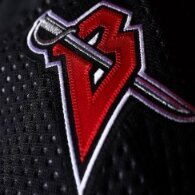
GASabresIUFAN Posted December 27, 2018 Report Share Posted December 27, 2018 I wouldn’t mind seeing the “B” with the sword on the shoulders again. I also wouldn’t a heritage type Jersey with the Pepsi Cap. ? 3 Quote Link to comment Share on other sites More sharing options...
Hoss Posted December 27, 2018 Report Share Posted December 27, 2018 4 hours ago, Robviously said: Royal blue and gold, and use last year’s Winter Classic as the template. And a gold alternate that’s basically just the white Jersey with white and gold swapped. Make the blue B with the sword through it the alternate logo and put it on the shoulders for all three jerseys. Done. I can get with this. It’s not too far out there creative wise but different enough to get me interested. I love the B logo but also loved the alternate logo they made for that game. Quote Link to comment Share on other sites More sharing options...
Andrew Amerk Posted December 27, 2018 Report Share Posted December 27, 2018 (edited) I’d be for a royal blue and gold goat head, whichw ould NEVER happen. (Photo provided not royal blue enough Edited December 27, 2018 by Andrew Amerk Quote Link to comment Share on other sites More sharing options...
North Buffalo Posted December 27, 2018 Report Share Posted December 27, 2018 11 hours ago, Broken Ankles said: Or.. Boo i actually liked those red ones tho colors just wrong. Quote Link to comment Share on other sites More sharing options...
Eleven Posted December 27, 2018 Report Share Posted December 27, 2018 (edited) 14 minutes ago, North Buffalo said: Boo i actually liked those red ones tho colors just wrong. Those were the best of that dark era. Anyone remember what the 16 patch is for? EDIT: It's for the retirement of LaFaontaine's number. I didn't recall that they wore black and red that late, but of course they did, and I still find it weird that they would wear a patch for a number retirement. Edited December 27, 2018 by Santa Claus Quote Link to comment Share on other sites More sharing options...
Kruppstahl Posted December 27, 2018 Report Share Posted December 27, 2018 I'm probably in the vast minority when I say I liked the red/white/black era! The goat head was horrible, but the all black uniforms were f-ing mean. I personally like the darker blue color; the lighter "royal blue" and gold and white is pretty cheesy. You don't really see a lot of things in the world of design in royal blue, gold, and white. The best you can hope to do with the scheme, IMO, is this, but it requires the addition of red to the colors: 1 Quote Link to comment Share on other sites More sharing options...
Recommended Posts
Join the conversation
You can post now and register later. If you have an account, sign in now to post with your account.