inkman Posted November 25, 2017 Report Share Posted November 25, 2017 Great, you don't like them. You've made it abundantly clear. Feels like you are chastising me for relating what people in the world are saying. Sorry for mentioning that people in the world have a different opinion than you. Or people just like different things than you. Good god. Kill the messenger. For what it's worth apparently they make sense and are appealing to a lot of other people in this world. It's not my fault, go blame them. I'm not blaming anyone for liking them, I'm blaming the designer as they could have done sooooo much better. I'd like to strive for that...better. Quote Link to comment Share on other sites More sharing options...
PASabreFan Posted November 25, 2017 Report Share Posted November 25, 2017 Finally saw the Rangers jersey and the NY is on theirs too, even more prominently. I'm sure Rangers fans love that. You don't tell New Yawkers where they live! It's just goofy. Quote Link to comment Share on other sites More sharing options...
SwampD Posted November 25, 2017 Report Share Posted November 25, 2017 I'm not blaming anyone for liking them, I'm blaming the designer as they could have done sooooo much better. I'd like to strive for that...better. I'm just not sure this is true. Good and bad is subjective when it comes to unis, and there will always be people that don't like something,… or some that like everything,… or some don't like anything. I just don't know why people care so much. I just want them to win. Quote Link to comment Share on other sites More sharing options...
Marvelo Posted November 25, 2017 Report Share Posted November 25, 2017 :unsure: So ... is all red good or bad? All red is bad. Quote Link to comment Share on other sites More sharing options...
PASabreFan Posted November 25, 2017 Report Share Posted November 25, 2017 All red is bad. She's a tiger though. I wouldn't want to face her in court. Quote Link to comment Share on other sites More sharing options...
Marvelo Posted November 25, 2017 Report Share Posted November 25, 2017 (edited) She's a tiger though. I wouldn't want to face her in court. Shes going down, the big phony. Edited November 25, 2017 by Marvelo Quote Link to comment Share on other sites More sharing options...
Sabres Fan in NS Posted November 25, 2017 Report Share Posted November 25, 2017 Ditto. Except, I'd change that to people in this forum. This uni is a breath of fresh air, compared to the current ones. The new ones will look even better on television. Let's make a nice royal blue "home" jersey to match, get rid of the "NY", and be done with it. Welcome Jim. How is Maui? It took you a while to post, eh? Quote Link to comment Share on other sites More sharing options...
josie Posted November 25, 2017 Report Share Posted November 25, 2017 You're going to give Josie flashbacks to bad clients. Yup. That's design in a nutshell. I like them but they look like a case of someone having a good retro look and then being told to rein it in to be safe. But then I see the people in the design community around here who get those jobs and... I'm sorry, their work is always really boring. "Solid" and "Traditional" are synonyms for "safe" and "what we always do". And then you get the third jersey turdburgers which are just a bunch of alcoholic chefs who got into the cooking sherry and had made sh!t smoothies all over the kitchen of design. If you ask me, which you didn't, these should be our regular away jerseys (minus the stupid little NY on the logo), and our Winter Classic money grab chance to do something cool should hearken to the literal sweaters of the 20s but with a Buffalo theme. The colors are right, the design is banal, but I still like them. Sue me. Quote Link to comment Share on other sites More sharing options...
carpandean Posted November 25, 2017 Report Share Posted November 25, 2017 All red is bad. But aren't you advocating for ... Quote Link to comment Share on other sites More sharing options...
Maui Jim Posted November 25, 2017 Report Share Posted November 25, 2017 Does the 06-07 alternate jersey work for you? http://www.sportslogos.net/logos/view/qidhh7lrf28lq1grjex7/Buffalo_Sabres/2007/Alternate_Uniform Interesting. That would be a real land mine for Pegula. I wonder if enough of the old-timers are gone and enough of the fans are younger to tolerate a color scheme change. The change to black and red and then back to blue and gold is an interesting case study. Correlation or causation? I still say the combination of dark and light blue in the St. Louis sweater looks great. I liked those better than the current. If we could've updated the "Aud" home and away jerseys just a bit, but left them royal blue, gold and white, it would've been perfect. That's kind of why I like the new winter classic jersey. Quote Link to comment Share on other sites More sharing options...
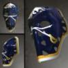
Marvelo Posted November 25, 2017 Report Share Posted November 25, 2017 But aren't you advocating for ... post-2267-0-64453600-1511610933.jpg It's not all red. There's white and blue in there. Quote Link to comment Share on other sites More sharing options...
carpandean Posted November 26, 2017 Report Share Posted November 26, 2017 It's not all red. There's white and blue in there. Right ... and also in here: Quote Link to comment Share on other sites More sharing options...
Marvelo Posted November 26, 2017 Report Share Posted November 26, 2017 Right ... and also in here: Its the crest and the socks ...and dont forget the alternate white Unis... Quote Link to comment Share on other sites More sharing options...
MattPie Posted November 27, 2017 Report Share Posted November 27, 2017 There are enough variations of Red White and Blue around the league, Blue and Gold stays (don't really care which Blue). If you want to unify, change the Bills, there's even more variations on Red White and Blue in the NFL; go with something unique. Quote Link to comment Share on other sites More sharing options...
sabills Posted December 6, 2017 Report Share Posted December 6, 2017 I didn't watch the game last night, but apparently there was a weird camera thing that made our unis look royal instead of navy blue...gorgeous. Quote Link to comment Share on other sites More sharing options...
gomper Posted December 6, 2017 Report Share Posted December 6, 2017 I didn't watch the game last night, but apparently there was a weird camera thing that made our unis look royal instead of navy blue...gorgeous. I noticed that too. Beautiful to watch. Quote Link to comment Share on other sites More sharing options...
miles Posted December 6, 2017 Report Share Posted December 6, 2017 that is so much better than the real color. i vote to change it Quote Link to comment Share on other sites More sharing options...
carpandean Posted December 6, 2017 Report Share Posted December 6, 2017 that is so much better than the real color. i vote to change it Seconded! Quote Link to comment Share on other sites More sharing options...
North Buffalo Posted December 6, 2017 Report Share Posted December 6, 2017 (edited) Motion agreed to, and it laid upon the table, now hope the President signs it.. that is you TPegs Edited December 6, 2017 by Kottbullar Quote Link to comment Share on other sites More sharing options...
CallawaySabres Posted December 6, 2017 Author Report Share Posted December 6, 2017 Not until the 50th. They are already planning on it....they will run through every jersey design that season and then finalize with the royal blue. Quote Link to comment Share on other sites More sharing options...
Maui Jim Posted December 8, 2017 Report Share Posted December 8, 2017 Welcome Jim. How is Maui? It took you a while to post, eh? Thanks, Sabresflakt. Maui is awesome. I'll be there again in February. Can't wait. Quote Link to comment Share on other sites More sharing options...
Sabres Fan in NS Posted December 8, 2017 Report Share Posted December 8, 2017 Thanks, Sabresflakt. Maui is awesome. I'll be there again in February. Can't wait. Sounds great. My brother lived on Kaui for about 10 years and loved it. Once he married and had kids they all felt they were too far from grandparents and all, so they moved to Florida. Please call me NS ... I am really Sabres Fan In NS, but go by NS. I am participating in the boards Swedish Revolution at the moment. *Stalin For Dhalin*. Quote Link to comment Share on other sites More sharing options...
North Buffalo Posted December 9, 2017 Report Share Posted December 9, 2017 Had an opportunity to move out there a couple years ago on an offer... but the schools stink and I have a special needs child... so no bueno... still wish it could have worked out. Quote Link to comment Share on other sites More sharing options...
Brawndo Posted January 10, 2018 Report Share Posted January 10, 2018 #Sabres announce they'll wear their Winter Classic jerseys at home on 2/4, 2/18 & 4/4 Per Sabres Quote Link to comment Share on other sites More sharing options...
Jacque Richard Posted January 10, 2018 Report Share Posted January 10, 2018 Just once I'd like the Sabres to wear the uniform of the 1969-70 AHL champion Buffalo Bisons. It's a red-hot zinger, as opposed to any of the mediocrities the Sabres ever came up with. I don't care if Coke is the concessionaire in the arena, whatever it's called now. Change it to Pepsi. Buffalo has always been a Pepsi town, not Coke. The Pegulas can afford anything. Instead, they play with the teams like they're some gardening project. Turdburger or All-red Bills uniform? The Pegulas have bad uniform ideas cornered...while always missing what's obvious, right in front of their face and great. Further, I'd ditch the blue and yellow forever and have solidarity with the Bills with the red, white and blue color scheme... What blue/yellow team in any sport ever won a championship? If there was one or two in the entire history of sports, I'd be surprised. Blue and yellow are weak and tired colors. The yellow in particular has seeped into the Sabres character...they should have a yellow streak running down the back of the uniform because that's the ingrained cowardly character of the team. Pittsburgh united the sports teams with one color scheme and Buffalo has become Pittsburgh Jr. so why not? guy trottier Quote Link to comment Share on other sites More sharing options...
Recommended Posts
Join the conversation
You can post now and register later. If you have an account, sign in now to post with your account.