Thorny Posted July 20, 2019 Report Share Posted July 20, 2019 4 hours ago, Kruppstahl said: Someone please explain the generally accepted widespread love for "royal blue" with our uniforms. I find it to be cheesy and the deep navy blue is a much classier, longer lasting look. I agree it does tend to look too dark on TV, but that's a different matter entirely. Honestly, this is the biggest thing, to me. My navy blue Eichel jersey looks great hanging in my closet but I'm kinda tired of watching the Boston Bruins/Pittsburgh Steelers on most television Sabres broadcasts. Most of the time I'm looking at the jerseys is during the games so I'm ready for royal. Quote Link to comment Share on other sites More sharing options...
steveoath Posted July 21, 2019 Report Share Posted July 21, 2019 On 7/19/2019 at 6:47 PM, Sabel79 said: Eh...making soccer jerseys out of non-soccer sports, rock bands, and whatever else is a thing the internet enjoys for some reason. Socceys are a thing over here in euroland. Glasgow Clan Socckeys Euro Socckeys Quote Link to comment Share on other sites More sharing options...
shrader Posted July 22, 2019 Report Share Posted July 22, 2019 On 7/20/2019 at 7:04 PM, Thorny said: Honestly, this is the biggest thing, to me. My navy blue Eichel jersey looks great hanging in my closet but I'm kinda tired of watching the Boston Bruins/Pittsburgh Steelers on most television Sabres broadcasts. Most of the time I'm looking at the jerseys is during the games so I'm ready for royal. With today's TVs, most teams should be wearing bright colors. Obviously I don't mean Seattle Seahawk highlighter bright, but we need to move away from the color schemes that may as well have been intended for black and white TVs. 1 Quote Link to comment Share on other sites More sharing options...
Huckleberry Posted July 22, 2019 Report Share Posted July 22, 2019 This would have made a great 50 year jersey. ? 1 Quote Link to comment Share on other sites More sharing options...
sodbuster Posted July 22, 2019 Report Share Posted July 22, 2019 I'm sorry, but every time I see a blue and gold goathead, I get a Billy Buffalo vibe. 1 Quote Link to comment Share on other sites More sharing options...
pi2000 Posted July 22, 2019 Report Share Posted July 22, 2019 Looks too much like St. Louis. I knda hope if they go back to royal that they add some 3rd color to give it some pop.. like some silver or red or something... maybe. Quote Link to comment Share on other sites More sharing options...
Drunkard Posted July 23, 2019 Report Share Posted July 23, 2019 14 hours ago, pi2000 said: Looks too much like St. Louis. I knda hope if they go back to royal that they add some 3rd color to give it some pop.. like some silver or red or something... maybe. Like some sweet grey pit stains? Keeping gray as a secondary color when they switched back to blue and gold was the second worst decision the team made after that ugly slug logo. 1 Quote Link to comment Share on other sites More sharing options...
PASabreFan Posted July 23, 2019 Report Share Posted July 23, 2019 On 7/22/2019 at 9:33 AM, shrader said: With today's TVs, most teams should be wearing bright colors. Obviously I don't mean Seattle Seahawk highlighter bright, but we need to move away from the color schemes that may as well have been intended for black and white TVs. They look nice on my Zenith. Quote Link to comment Share on other sites More sharing options...
Taro T Posted July 23, 2019 Report Share Posted July 23, 2019 14 minutes ago, PASabreFan said: They look nice on my Zenith. Zenith. Not sure who their CEO was, but he could be considered the Tim Murray of electronics. Sold off all their profitable divisions (they made a ton of different products) to focus on HDTV while the standards were still being developed and did not win that battle. Too bad. They did make good consumer electronics. Quote Link to comment Share on other sites More sharing options...
darksabre Posted July 23, 2019 Report Share Posted July 23, 2019 25 minutes ago, PASabreFan said: They look nice on my Zenith. The Sylvania finally kicked the bucket eh? Quote Link to comment Share on other sites More sharing options...
Kruppstahl Posted July 23, 2019 Report Share Posted July 23, 2019 On 7/20/2019 at 7:04 PM, Thorny said: Honestly, this is the biggest thing, to me. My navy blue Eichel jersey looks great hanging in my closet but I'm kinda tired of watching the Boston Bruins/Pittsburgh Steelers on most television Sabres broadcasts. Most of the time I'm looking at the jerseys is during the games so I'm ready for royal. It raises an interesting question. Should uniform color be prioritized for a good look on TV? Or should it be about how it looks in real life or in person at a game? I certainly see the uniforms a lot more on TV than in person! And I also watch most games on center ice, in low definition! A lot of games look like I am watching a VHS recording from 1987. Everything is pixelated and the dark blue uniforms look like a pitch black ink stain on the screen. Maybe we should try lighter hues of blue! 20 minutes ago, Taro T said: Zenith. Not sure who their CEO was, but he could be considered the Tim Murray of electronics. Sold off all their profitable divisions (they made a ton of different products) to focus on HDTV while the standards were still being developed and did not win that battle. Too bad. They did make good consumer electronics. Remember when American companies actually made consumer electronics?! 1 1 Quote Link to comment Share on other sites More sharing options...
Taro T Posted July 23, 2019 Report Share Posted July 23, 2019 46 minutes ago, Kruppstahl said: It raises an interesting question. Should uniform color be prioritized for a good look on TV? Or should it be about how it looks in real life or in person at a game? I certainly see the uniforms a lot more on TV than in person! And I also watch most games on center ice, in low definition! A lot of games look like I am watching a VHS recording from 1987. Everything is pixelated and the dark blue uniforms look like a pitch black ink stain on the screen. Maybe we should try lighter hues of blue! Remember when American companies actually made consumer electronics?! Yep. Quote Link to comment Share on other sites More sharing options...
Drunkard Posted July 23, 2019 Report Share Posted July 23, 2019 1 hour ago, Kruppstahl said: Remember when American companies actually made consumer electronics?! Ah, the good old days when televisions weighed a ton and it costs multiple paychecks to buy one. Quote Link to comment Share on other sites More sharing options...
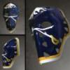
That Aud Smell Posted July 23, 2019 Report Share Posted July 23, 2019 that thing is all over the Twitter right now apparently screen grabbed from an online adidas store (?) 1 Quote Link to comment Share on other sites More sharing options...
bg17 Posted July 23, 2019 Report Share Posted July 23, 2019 I like it. Let the whining begin! 1 Quote Link to comment Share on other sites More sharing options...
Randall Flagg Posted July 23, 2019 Report Share Posted July 23, 2019 Love it Quote Link to comment Share on other sites More sharing options...
WildCard Posted July 23, 2019 Report Share Posted July 23, 2019 Eh, could be worse 1 Quote Link to comment Share on other sites More sharing options...
#freejame Posted July 23, 2019 Report Share Posted July 23, 2019 4 minutes ago, That Aud Smell said: that thing is all over the Twitter right now Not the worst Sabres jersey ever. Certainly not the best jersey either. Quote Link to comment Share on other sites More sharing options...
That Aud Smell Posted July 23, 2019 Report Share Posted July 23, 2019 2 minutes ago, #freejame said: Not the worst Sabres jersey ever. Certainly not the best jersey either. It appears that they went ahead and tried to "pull off" the colour gold on a uniform. Historically tricky, that. Also: That's a lot of stripes. I guess it's 5 stripes for 5 decades? Quote Link to comment Share on other sites More sharing options...
sodbuster Posted July 23, 2019 Report Share Posted July 23, 2019 Hey, not bad. Quote Link to comment Share on other sites More sharing options...
darksabre Posted July 23, 2019 Report Share Posted July 23, 2019 Notice the various logos inside the collar. I think it'll look better in person. Quote Link to comment Share on other sites More sharing options...
PASabreFan Posted July 23, 2019 Report Share Posted July 23, 2019 Does the buffalo's eyes follow you? Is there an image hidden in there? Lenticular printing? Or you stare at it to reveal a spaceship over the arena? That would be pretty cool. Quote Link to comment Share on other sites More sharing options...
Taro T Posted July 23, 2019 Report Share Posted July 23, 2019 41 minutes ago, That Aud Smell said: that thing is all over the Twitter right now apparently screen grabbed from an online adidas store (?) Considering what they've done recently, could've been a lot worse. Overall, the sweater is fine. Not a fan of the "textured" golden buffalo nor the golden sabers. Hopefully they look better in person if this is the real 50th. Also, would prefer Royal blue. 2 Quote Link to comment Share on other sites More sharing options...
steveoath Posted July 23, 2019 Report Share Posted July 23, 2019 If they do this as a hoodie, I'm all in. Quote Link to comment Share on other sites More sharing options...
pi2000 Posted July 23, 2019 Report Share Posted July 23, 2019 hmmmm, as I sit waiting to get an MRI after a hip injection... I do like the simplicity, would need to see it in a different light tho. 1 Quote Link to comment Share on other sites More sharing options...
Recommended Posts
Join the conversation
You can post now and register later. If you have an account, sign in now to post with your account.